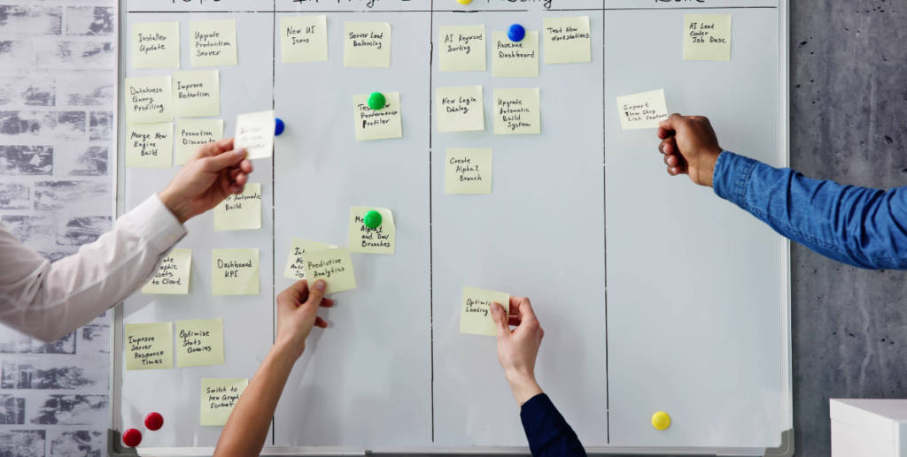
The HEART Framework: Measuring UX Success with Purpose

Design changes are often accompanied by heated debates and subjective arguments. Statements like, “I don’t think this will work” or “I don’t like it” are common in design discussions, and while A/B testing might seem like the solution, it’s crucial to first know what metrics truly matter. The HEART framework, developed by Google, helps bridge the gap between design intuition and measurable impact by providing structured, actionable metrics for UX improvements.

This article explores how the HEART framework can support a data-driven design process, empowering designers to confidently present the impact of their work.


Why Metrics Matter in Design

Improving UX should always be measurable. If it’s not, we need to question the change, as it becomes nearly impossible to determine its success or failure. When teams aren’t aligned on what to measure, design decisions risk being vague and subjective. Enter the HEART Framework and the Goals-Signals-Metrics (GSM) process, two methods developed by Google to clarify UX goals and link them to meaningful metrics.

Understanding the HEART Framework

The HEART framework breaks down the user experience into five measurable areas:

  1. Happiness
  2. Engagement
  3. Adoption
  4. Retention
  5. Task Success

Each area is approached by setting specific goals, identifying signals that indicate progress, and establishing metrics to measure success.

1. Adoption

Adoption focuses on new user uptake—how many people use a feature or product for the first time. It reflects the initial appeal of a feature and how well it aligns with user needs.

  • Goal: Increase user interest in a new feature.
  • Signal: Users register for an account or activate a new feature.
  • Metrics: Download rate, registration rate, feature adoption rate.

For instance, if you’re running a course for designers and tracking conversion rates, the adoption metric would indicate how many visitors sign up after visiting your landing page.

2. Task Success

Task success measures how effectively users complete tasks within your product, focusing on efficiency and accuracy.

  • Goal: Users can complete tasks without unnecessary frustration.
  • Signal: High task completion rates and low error rates.
  • Metrics: Error rate, time to task completion, task completion rate.

For a course platform, task success could include tracking completion rates or the time users take to complete lessons. In a blog, you might track how many readers scroll to the end of an article and how long they take.

3. Engagement

Engagement reflects the frequency and depth of interaction with your product. High engagement can indicate that users find value and enjoyment in your product.

  • Goal: Increase interaction with content or features.
  • Signal: Users visit frequently and explore multiple sections.
  • Metrics: Pageviews, visit frequency, average session duration.

If you track engagement on a website, you might monitor how often users return within a set period or the open rate of your email newsletters.

4. Retention

Retention tracks users who return to your product over time. It’s an indicator of sustained interest and satisfaction, reflecting the long-term value of your offering.

  • Goal: Encourage repeat visits and long-term usage.
  • Signal: Users return regularly after their initial experience.
  • Metrics: Retention rate, churn rate, repeat usage frequency.

In a mobile app, for example, retention could be measured by the percentage of users who continue using the app after 30 days.

5. Happiness

Happiness captures user satisfaction and perception of your product. Measuring happiness often involves surveys and feedback tools to gauge user sentiment.

  • Goal: Users feel positive about their experience.
  • Signal: Users report high satisfaction and ease of use.
  • Metrics: Net Promoter Score (NPS), satisfaction ratings, survey feedback.

The Net Promoter Score (NPS) is a widely used metric to measure happiness, assessing how likely users are to recommend your product to others on a scale of 0-10. High scores reflect strong user loyalty and satisfaction.


Using the HEART Framework with the GSM Process

The Goals-Signals-Metrics (GSM) process complements the HEART framework by structuring each metric around specific goals, signals, and quantifiable data points. Here’s how GSM aligns with the HEART framework:

  1. Define Goals: Start with broad objectives. For example, a goal for “Happiness” might be, “Users find the app intuitive and helpful.”
  2. Identify Signals: Set indicators of progress. In the case of “Happiness,” this might be, “Users recommend the app to friends.”
  3. Establish Metrics: Pin down quantifiable metrics to track success. For the above example, this might be “number of referrals” or “average NPS rating.”

This layered approach ensures that metrics are tied to meaningful outcomes, creating alignment across design and business objectives.

The Designer’s Advantage: Measurable Impact

The HEART framework not only improves UX outcomes but also serves as a powerful tool for designers to demonstrate their impact. Design decisions backed by data speak volumes in business settings, enabling designers to clearly show how their work drives value.

Example: During a performance review, instead of subjective claims about design quality, a designer could present metrics demonstrating a 20% increase in conversion or a 40% reduction in error rates. Business stakeholders often appreciate metrics that translate into real-world improvements, from increased user engagement to reduced churn.

A Strategic Approach: Ordering Metrics by User Journey

While the acronym HEART is easy to remember, it may be beneficial to reorder the metrics for brainstorming and strategic planning according to the user journey:

  1. Adoption: The initial user onboarding or feature adoption.
  2. Task Success: The ability for users to achieve their intended outcomes.
  3. Engagement: The depth and frequency of user interaction.
  4. Retention: Users returning and continually engaging with the product.
  5. Happiness: Users’ overall satisfaction and positive perception.

This order aligns with a typical customer lifecycle, making it easier to analyze user behavior step-by-step.

Summary

The HEART framework and GSM process bring structure to design discussions, enabling product teams to ground design changes in measurable outcomes. By incorporating metrics, designers can elevate their work beyond aesthetics, showing the tangible value they bring to the user experience. Not only does this foster a more effective design process, but it also positions designers to communicate their impact in business terms.

By focusing on data, we can make design decisions that are strategic, impactful, and aligned with real user needs. When we measure, we don’t just improve — we ensure that our improvements matter.


Using Personas to Understand Player Behavior

Watching someone play a game you’ve worked on can be a rollercoaster. You might think, “Why won’t they use that weapon I designed?” or “Why aren’t they reading the story text?” Frustrations like these are common, but there’s a solution that could transform this experience from painful to productive: embracing personas.

Personas, a concept introduced by Alan Cooper in The Inmates Are Running the Asylum, can help us understand different types of players. Personas go beyond demographics like age or location; they bring specific player motivations, preferences, and playstyles into focus. Adopting personas allows game designers to anticipate different behaviors, align with player needs, and create better gameplay experiences.

The Power of Personas in Game Design

Using personas helps game designers visualize the different types of players they are creating for. This foresight is especially useful during the early stages of game design, preventing the need for extensive changes once the game reaches testing.

For example, consider a classic sniper level like “All Ghillied Up” in Call of Duty: Modern Warfare. The designers created an immersive, slow-paced experience that required players to remain stealthy. If they’d had a persona like “Speedrun Sam” in mind, they could have anticipated the need for pacing adjustments to ensure Sam stays engaged. Similarly, a persona like “Shoot First Shawn” could have guided designers to keep enemies out of sight until the right moment, ensuring players don’t accidentally break the intended gameplay flow.

Creating Your Personas

Developing personas doesn’t have to be complex. Start by considering your players’ playstyles, motivations, and frustrations. Here’s a basic framework to build on:

  1. Name – Be descriptive and memorable. Names like “Speedrun Sam” or “Narrative Nancy” can bring personas to life.
  2. Age – Choose a representative age range or specific number that aligns with your target demographic.
  3. Photo – Find a stock image or illustration that visually represents the persona.
  4. Motivations – Describe how this persona plays, what interests them, and what they find frustrating in games.

Here are some sample personas:

  • Speedrun Sam, 19
    Sam’s goal is efficiency. He skips text, cuts corners, and speeds through every game as quickly as possible. If he encounters a mechanic that slows him down, he’s likely to get frustrated.
  • Narrative Nancy, 26
    Nancy loves story-driven games and details. She reads every bit of lore, appreciates world-building, and prefers a slower pace to take in the experience. She’s not in it for trophies but to immerse herself in the game’s universe.

When you create personas specific to your game, get the entire team involved. Collective input fosters a shared understanding, ensuring these personas resonate throughout the development process.

Leveraging Personas in Development

Once you’ve established personas, make them a core part of your design discussions. Post them in visible areas or keep digital versions handy. Ask yourself, “What would Speedrun Sam do here?” or “Is Narrative Nancy going to enjoy this sequence?”

Remember, personas are a tool, not a constraint. Not every design element needs to cater to every persona, nor should you overburden the team by creating too many personas. Identify key personas that align with the primary experience you want to create.

Updating Your Personas

Personas should evolve with your game and audience. As new games release and genres expand, player expectations shift. Revisit your personas periodically, especially after playtesting. Adjust them based on new insights, put some in “cryo-sleep” if they’re not currently relevant, and tweak others to reflect emerging player behaviors.

By keeping personas fresh and relevant, you ensure that your design remains player-centered. The more you understand your audience, the better your chances of creating an experience that resonates with them.

In Conclusion

Personas bring player motivations and behaviors into clear focus, helping you design with specific players in mind. Whether you’re creating a high-tension stealth level or a story-driven quest, personas provide a compass to keep your design aligned with user expectations. Embrace this tool, and you’ll find your game feels more engaging and authentic to the players who experience it. When you care about your players’ needs, they’ll care about your game.

Analytics & UX Design

Using Google Analytics as a Powerful UX Tool

Google Analytics (GA) is typically thought of as a tool for measuring web traffic and marketing performance, but its potential as a UX tool is often overlooked. With a user-friendly interface, extensive data insights, and minimal developer intervention after initial setup, GA can provide invaluable support for UX designers and researchers.

This article unpacks practical ways to use GA for UX, with tips on getting started and leveraging specific features for user research, journey analysis, and A/B testing. Let’s dive into how GA can enhance your UX approach.

Getting Started with Google Analytics for UX

GA’s standard version is free and can be installed on any web-based or native app. Simply set up an account, add your tracking code, and open your website in the “Real Time” section of GA to start seeing live user activity.

Key Metrics and Dimensions for UX

GA’s metrics and dimensions offer a wealth of data on user behavior. Dimensions describe attributes of your visitors, like their age, while metrics measure these attributes, like the number of times a page was viewed.

Useful UX Metrics

Some metrics can provide valuable insights into user experience:

  • Demographics: GA gives access to demographic data like age, gender, and location, helping UX designers understand their audience. However, keep in mind that this data is only collected for users logged into Google.
  • Device and Browser Usage: Knowing the devices, operating systems, and browsers your users prefer can guide responsive design efforts and ensure cross-platform compatibility.
  • Time on Page: Indicates user engagement on a particular page or screen. A high time on page could suggest valuable content, while a low time might indicate layout or content issues.
  • Session Duration: Measures how long users stay on your site per visit. Combine this with bounce rate or exit rate for insights into the effectiveness of user journeys.
  • User Journey: Metrics like “Landing Page,” “Page Depth,” and “Next Page Path” reveal where users enter, how deeply they navigate, and the paths they take, offering a window into how intuitive your site structure is.

Site Speed Insights

Page load speed is a critical UX factor. GA’s “Site Speed” metric helps you track the performance of your site by browser and page. Google uses an average sample for these measurements, which can provide an overall view of speed but may not reflect every user’s experience.

Tip: Use speed data qualitatively to identify high-level performance issues, as one slow load time could skew your averages.

Understanding User Intent with Google Ads, Search Console, and Site Search

Connecting GA with Google Ads and Search Console unlocks new user intent data that can bridge UX and marketing efforts. Features like “Search Query” reveal terms users searched to reach your site, providing insights into user needs and interests. Combining search queries with session duration and bounce rate can reveal if users found what they were looking for.

Example: A user searching for a specific feature may indicate a product interest or need. Analyze their subsequent journey to see if they engaged with related content, helping you adjust UX to better meet user intent.

Events: Tracking Interactions for Deeper Insights

Events in GA are highly customizable, allowing you to track any interaction a user takes within your app or site. Events are composed of three dimensions:

  • Category: Groups events into types (e.g., “Forms” or “Navigation”).
  • Action: Describes the action taken (e.g., “Click” or “Scroll”).
  • Label: Adds context to the action (e.g., “Submit Button”).

UX Applications for Events

Examples of events that provide UX insights include:

  • Scroll Depth: Understand whether users reach the end of a page, highlighting potential layout issues.
  • UI Interactions: Track interactions with elements like buttons, menus, or banners, helping gauge the effectiveness of key UI components.
  • Form Interactions: Identify where users encounter issues in forms, from field validation to submission.
  • Content Engagement: Measure how users interact with specific content sections, combining time on page with scroll depth.

Note: While events need to be set up manually, using Google Tag Manager can make event tracking easier and scalable.

Analyzing User Flow and Behavior

GA includes several tools that help UX designers understand how users navigate their sites or apps:

  • Navigation Summary: Shows where users came from and where they went next, allowing you to see if users flow as intended.
  • Behavior Flow: Provides a visual representation of user paths through the site. Although this view doesn’t show every single page, it gives a broad overview of major navigation trends.
  • User Explorer: Offers a detailed view of individual user journeys, including session details and triggered events, based on a cookie ID. While limited by device-dependence, this feature offers granular data for analyzing user behavior patterns.

Custom Dimensions: Extending GA’s Data Capabilities

Sometimes you need data beyond GA’s default metrics. Custom dimensions allow you to capture unique data points from any user interaction. For example, you could set up a custom dimension to track user marital status if relevant to your product’s experience.

Setting Up Custom Dimensions

Identify the data you need and create events that capture it, like marital status selection in a form. Once set, custom dimensions can be analyzed alongside default metrics, providing richer insights.

Testing UX Hypotheses with Google Optimize

GA’s integration with Google Optimize facilitates A/B testing and personalization, allowing you to test UX variations directly within your site without altering the code. Optimize offers four types of experiments:

  1. A/B Test: Test two or more variants, adjusting traffic distribution.
  2. Multivariate Test: Test different combinations of changes to identify the best combination.
  3. Redirect Test: Send traffic to different URLs for comparison.
  4. Personalization: Customize the experience for specific user groups.

Optimize’s visual editor simplifies testing, letting you modify content, styles, and elements for users who meet specific criteria. You can track test results in GA to see which version yields the best outcomes.

Presenting UX Insights with Data Studio

Once you’ve gathered valuable insights from GA, presenting your findings is the next step. Google Data Studio is a free data visualization tool that integrates with GA, allowing you to customize reports and create visuals for easier data interpretation.

Example: A Data Studio dashboard might feature graphs on session duration, heatmaps of user flows, and event interactions, providing a comprehensive look at user behavior.

Conclusion: Google Analytics as a UX Ally

Google Analytics offers a powerful toolkit for UX designers. From understanding user demographics to tracking detailed interaction events, GA enables data-driven decisions that can enhance the user experience. Remember that GA gives you data, but it’s up to you to derive actionable insights. When combined with tools like Google Optimize and Data Studio, GA becomes an indispensable part of any UX designer’s toolkit, helping you craft experiences that better align with user needs.

Building a UX Strategy That’s User Centered

Building a User-Centered UX Strategy: Essential Tools and Frameworks

Before diving into the design phase with prototypes, sitemaps, or wireframes, it’s critical to ask the right questions to shape a product aligned with users’ needs and business goals. Effective UX design puts the user at the core of every decision. This user-centered approach improves interactions with your brand by incorporating insights from user emotions, behaviors, and desires.

Yet, many companies bypass research, relying on assumptions or intuition about user behaviors. A comprehensive understanding of the target audience, however, can elevate UX to a strategic asset. Here’s how to establish a well-rounded UX strategy using essential frameworks and tools to align user experience with broader business objectives.

Step 1: Organize with a UX Strategy Framework

A UX strategy framework provides a structured approach to the UX process, enabling designers to break down complex ideas and map them towards project goals. The framework typically involves four stages:

  1. Collect Problems: Identify challenges and user pain points through user research, interviews, and data analysis.
  2. Generate Solutions: Brainstorm and propose potential solutions to address these challenges.
  3. Prioritize Segments: Focus on high-impact areas based on user needs and business goals.
  4. Implement Ideas: Move forward with solutions, refining them through iterative testing and feedback.

Tools for Structuring Ideas

Popular tools for managing this flow include Kanban boards and the 360° View. Both help keep track of tasks, decisions, and user insights visually, creating a clear view of project progress.

  • Kanban Boards: Often seen in tools like Trello, Kanban boards visually organize tasks, from problem collection to implementation. Sticky notes on Kanban boards help prioritize tasks and facilitate team collaboration.
  • 360° View Diagram: This holistic tool incorporates three essential elements—user needs, business goals, and technological feasibility—into a unified view, enabling teams to evaluate opportunities where these elements intersect.

Step 2: Identify the User through Proto-Personas

Proto-personas are preliminary versions of personas that summarize key characteristics of your target audience. They outline the user’s demographics, needs, goals, and behaviors, providing a reference point during initial design phases.

Creating Proto-Personas

  1. Gather the UX team and brainstorm assumptions and observations about the target users.
  2. Develop a profile outlining core traits: name, age, goals, challenges, preferences, and habits.
  3. Group similar profiles and prioritize primary and secondary proto-personas.

Proto-personas can be refined as more data is gathered through interviews and surveys, ultimately evolving into fully developed personas based on validated insights.

Step 3: Blueprint Strategy for Mapping Experiences

A Blueprint Strategy maps out all points of contact between the user and the brand, including internal processes necessary to support these interactions. It provides a comprehensive view of the customer journey, revealing where improvements can be made.

Applying the Blueprint Strategy

To effectively use a UX Blueprint, break down the journey into several boards, addressing the following areas:

  • Challenges: Identify problems and obstacles to overcome.
  • Aspirations: Define desired outcomes and objectives.
  • Focus Areas: Prioritize which elements of the strategy will yield the greatest impact.
  • Guidelines: Outline principles to guide design choices and maintain consistency.
  • Activities: List tasks that support the achievement of aspirations.
  • Measurements: Establish metrics to evaluate the success of each stage.

The Blueprint Strategy encourages exploration and iteration. Cross off items, rearrange ideas, and return to challenges as necessary to refine your approach. This adaptable model keeps the UX strategy aligned with both user needs and business goals, creating a structured approach to mapping and improving the user journey.

Step 4: Visualize the User Journey with a Customer Journey Map

The Customer Journey Map is a step-by-step representation of a user’s interaction with your service. This visual tool outlines various touchpoints, motivations, and challenges along the journey, highlighting where users find value or encounter obstacles.

Building a Customer Journey Map

  1. Map Touchpoints: Identify every interaction users have with your product or service, from initial discovery to final engagement.
  2. Define Motivations: Understand what drives users at each stage and address pain points where users may lose interest.
  3. Analyze Flow: Evaluate the user’s movement through each stage, making improvements to smooth out navigation and reduce friction.

This process reveals what aspects of your product experience are working well and where improvements can be made, guiding refinements to increase user satisfaction.

Step 5: Conduct Stakeholder Interviews for Strategic Insights

Stakeholder interviews provide critical input from individuals who influence or approve various aspects of the product. This dialogue ensures that UX goals align with business objectives, helping prioritize features and functionalities that drive value.

Key Questions to Ask Stakeholders

  1. About the Product: What are the expectations and goals for this product? What concerns do you have?
  2. About Users: Who is the target audience? What problems will this product solve for them?
  3. Relationship with the Initiative: What role does each stakeholder play in the development process? Who else should we consult?
  4. Marketing Insights: How does the product fit within the company’s brand and identity?
  5. Practical Details: What are the timeline and technical constraints? Are there any previously made decisions we should be aware of?

These questions, adapted from Kim Goodwin’s Designing for the Digital Age, help ensure the product meets user needs while aligning with the company’s strategic direction. Collecting insights from various stakeholders also fosters buy-in, paving the way for collaborative success.

Integrate Feedback and Iterate

UX strategy is an iterative process that adapts based on feedback from user testing and stakeholder input. A successful UX design doesn’t just look good but aligns with user needs, business goals, and technical capabilities. Regularly reviewing and refining each element of the UX strategy ensures the product remains on track and adapts to evolving requirements.

Conclusion

Developing a strong UX strategy involves much more than building an aesthetically pleasing interface. It requires understanding users, defining clear business goals, and working within technical constraints. Through frameworks such as the Kanban Board, 360° View, Proto-Personas, Blueprint Strategy, Customer Journey Map, and stakeholder interviews, you can build a comprehensive, user-centered UX strategy. Engaging both users and stakeholders at each stage of the process not only brings clarity to project goals but also creates a solid foundation for user satisfaction and business success.

Thinking about the UX of Mini Maps in Games

Designing and Placing the Mini Map: Guidelines for Game Developers

The mini map is a staple in many game genres, providing players with essential information to navigate and interact with the game world. But where should it be placed on the HUD, and what factors should guide its design? This article explores conventions and best practices for mini map placement, including genre-specific trends and practical guidelines to create an effective, user-friendly mini map.

Why Do Games Need a Mini Map?

Mini maps offer orientation and help ease navigation within game worlds. They evolved alongside world maps, particularly in RPGs and adventure games, as a compact means of providing real-time spatial awareness. Though not all genres need mini maps—puzzle, board, fighting, and some adventure games often forgo them—they’re nearly indispensable in fast-paced games such as shooters, RPGs, MOBAs, and racing games. In these genres, the mini map acts as a player’s primary tool for situational awareness.

Common Mini Map Conventions Across Genres

To understand mini map placement, we analyzed a selection of 66 games. While no strict standard exists, some clear patterns emerge:

  • MOBA Games: Typically place the mini map at the bottom left.
  • Strategy Games: Usually prefer the bottom left, favoring players’ lower visual fields.
  • MMORPGs: Frequently use the top right for their mini maps.
  • Racing Games: Often position the mini map on the left side of the screen.
  • First-Person Shooters: Also prefer the left side.

Mini Map Scope and Design Variations

The mini map’s scope and presentation vary by genre. Action and shooter games generally limit the mini map’s view to the player’s immediate surroundings. Meanwhile, in sports, MOBA, and racing games, the mini map may encompass a broader view of the game world. In genres with larger virtual environments, mini maps often include cardinal directions and use circular frames, reflecting a compass metaphor that aids navigation.

Guidelines for Mini Map Placement and Design

When deciding where to place a mini map, it’s essential to consider both player usability and established conventions within the genre. Misplaced mini maps can cause player frustration and confusion, particularly in fast-paced games where quick access to HUD elements is crucial.

1. Optimal Placement

  • Left-Side Placement: Western players tend to focus more on the left side of the screen, making it ideal for games that require rapid decision-making.
  • Minimize HUD Distance: Avoid placing the mini map too far from other core HUD elements. This minimizes eye movement, reducing reaction times and missed clicks.
  • Divide Information and Interaction Zones: Position the mini map within a “pure information” zone of the HUD, typically in the top half of the screen. If the map allows player interaction, consider placing it closer to interactive HUD elements at the bottom.

2. Visual Consistency

  • Integrate with HUD Aesthetics: Ensure the mini map’s design complements the overall HUD layout in terms of proportions, colors, and style.
  • Avoid Obstructing Essential Gameplay Elements: Place the mini map in a way that doesn’t obscure critical gameplay visuals unless it’s toggleable.
  • Consider Iconography and Color: Use high-contrast colors for important elements like allies, enemies, and objectives. Account for colorblind accessibility by using distinctive shapes or textures.

3. Information Display

Mini maps provide essential information that players rely on for situational awareness. Here’s a breakdown of essential and optional elements:

  • Must-Have Elements:
    • Player Position: Central to helping players orient themselves within the game.
    • Friends and Enemies: Mark opposing players or units in clear, distinguishable icons.
    • Barriers and Obstacles: Use color contrasts (e.g., dark for obstacles, light for accessible areas) to highlight boundaries.
    • Points of Interest: Checkpoints, bases, objectives, and other strategic markers.
  • Optional Elements:
    • Fog of War: Common in strategy games to obscure unexplored areas.
    • Health or Status Indicators: Show unit or player health in games with survival elements.
    • Terrain Details: Use subtle shading for elevation or terrain differences.
    • Peripheral Indicators: For large maps, peripheral arrows or symbols can indicate the direction of off-screen points of interest.

Interactivity Options

For games that allow it, a mini map can go beyond passive display by providing interactive options. These features enhance usability and give players greater control over navigation and communication:

  • Setting Waypoints: Players can mark specific destinations by clicking on the mini map.
  • Pings or Alerts: Useful in multiplayer games, these allow players to communicate through “Target” or “Retreat” pings.
  • Zoom Controls: Allow players to zoom in and out, potentially transitioning to a full-scale world map.
  • Drag or Pan: For larger maps, players may need to drag or scroll to view different segments.

Recommendations for Effective Mini Map Design

  1. Use Established Conventions: Players often have genre-based expectations for mini map location. If your game belongs to a genre with common mini map conventions, consider using them to ease players’ learning curve.
  2. Ensure Scalability: In games with large worlds or changing environments, a scalable mini map that adapts to zoom levels or displays relevant information based on player progression is essential.
  3. Prioritize Readability: A mini map should communicate key information at a glance. Opt for simple, recognizable icons over detailed illustrations to reduce cognitive load.
  4. Leverage Known Metaphors: Use universally understood icons—houses for bases, flags for checkpoints—to communicate game elements. When in doubt, simple geometric shapes (dots, arrows) are preferable to abstract symbols.
  5. Support Peripheral Awareness: Fast-paced games, particularly in the action and shooter genres, benefit from positioning the mini map within the player’s peripheral vision, reducing the need for direct eye contact and increasing reaction time.

Closing Thoughts

The placement and design of a mini map might seem trivial, but it plays a significant role in a player’s experience. By considering genre conventions, integrating design within the HUD, and ensuring clear readability, game designers can create mini maps that enhance rather than hinder gameplay. Thoughtful mini map design not only supports player orientation but also contributes to an overall immersive experience that keeps players engaged and fully aware of their surroundings.

Hiring Designers by Archtypes

Staffing Designers for Success: Using the Visionary, Cultivator, and Architect Archetypes

Assigning designers to projects that align with their strengths is essential for project success and team morale. Borrowing a model from the world of sales and adapting it for design, I’ve found that categorizing designers into three archetypes—Visionaries, Cultivators, and Architects—helps managers better match designers to the projects they’re naturally inclined to excel in.

Each archetype brings a unique perspective, and aligning designers with the project phases that best suit their strengths can enhance creativity, productivity, and personal growth.


The Designer Archetypes

Most designers lean toward one of these three archetypes:

  1. The Visionary: Inspired by new ideas and exploration.
  2. The Cultivator: Committed to thoughtful refinement and incremental improvement.
  3. The Architect: Systems-oriented, focused on maintaining consistency and cohesion.

Aligning these archetypes with project needs not only optimizes project outcomes but also helps designers thrive in roles that play to their strengths.


The Visionary: Inspired by Exploration and New Possibilities

The Visionary thrives on big ideas, forward-thinking concepts, and untapped possibilities. Visionaries bring expansive thinking and innovative approaches to the early stages of a project, where their bold ideas set the foundation for future work.

Strengths: Imaginative, pioneering, able to see strategic opportunities. Visionaries are excellent at conceptualizing novel approaches and identifying potential avenues for differentiation.

Strongest Phase: Project initiation, brainstorming, and launch phases.

Example: Our story artist at Animoodles embodies the Visionary. In early project stages, they generate fresh ideas, such as laying out initial storybook concepts and designing an eye-catching Kickstarter campaign. Their input during this phase helps define the project’s creative direction.


The Cultivator: Focused on Incremental Growth and Refinement

Cultivators excel at nurturing ideas into their best versions, drawing from user feedback, usability data, and strategic insights. They’re essential during mid-to-late project phases, where incremental improvements and fine-tuning become critical.

Strengths: Detail-oriented, analytical, patient. Cultivators are dedicated to enhancing quality over time and scaling the impact of designs.

Strongest Phase: Middle to late project stages, where ongoing adjustments are key.

Example: As a manager at Animoodles, I often take on the role of the Cultivator. This involves guiding product iterations, reducing production costs, and incorporating customer feedback to enhance the Animoodles brand. My role in evolving our product line builds brand loyalty and strengthens our connection with fans.


The Architect: System-Focused and Consistency-Driven

The Architect is a designer who works across all phases of a project, establishing cohesive systems and frameworks that support a unified design vision. Architects ensure that designs adhere to brand values, fostering trust and clarity.

Strengths: Systematic, communicative, consistency-focused. Architects contribute by maintaining design integrity, streamlining workflows, and aligning the team around shared design principles.

Strongest Phase: Continuous throughout the project lifecycle, as their work spans all phases to maintain cohesion.

Example: My cofounder at Animoodles embodies the Architect archetype. He designed the cohesive framework that unites all Animoodles characters, contributing to a consistent brand identity that draws in customers, team members, and partners alike.


Why Archetypes Matter in Project Staffing

Matching designers with projects based on their archetype can drive multiple benefits:

  • Improved Project Outcomes: Assigning designers where their strengths align with the project stage helps achieve strategic goals.
  • Professional Growth: Designers work in roles that engage their core skills, leading to greater satisfaction and development.
  • Enhanced Team Dynamics: Designers feel valued for their unique contributions, building a positive team environment.

However, it’s also important to consider individual skill sets and growth goals. These archetypes provide a strong framework, but a designer’s professional aspirations should also influence project assignments.

Continuously Monitor and Adjust for Long-Term Success

Perfectly matching archetypes to projects is an ongoing process. Regularly assessing the success of these alignments will reveal insights for future staffing decisions and project assignments. Monitoring outcomes also allows managers to adjust roles, ensuring that projects and designers are set up for continued success.

In conclusion, distinguishing designers as Visionaries, Cultivators, or Architects can improve project success and create a work environment where each designer’s strengths are fully utilized. By thoughtfully pairing designers with projects that align with their natural inclinations, managers can foster a team culture where creativity, collaboration, and growth thrive.

User Research in Games

Enhancing Game Design through Games User Research and Storyboarding

Game design is an art that blends creativity with a clear vision of the player’s experience. Yet, it can be challenging to evaluate if the final product aligns with the developer’s original intent. This is where Games User Research (GUR) steps in—a field focused on understanding how players interact with games to bring the final experience closer to what designers envisioned. GUR allows designers to observe player behavior, assess engagement, and adjust design elements to create a more immersive and enjoyable experience.

Understanding the Role of Games User Research

Games User Researchers (GURs) use various methods and tools to analyze player interactions, supporting developers in making informed design decisions. By observing user test (UT) sessions, GURs capture insights into player frustration points, engagement, and the ease with which players navigate game features. These insights are invaluable for aligning gameplay with design goals.

However, GUR’s effectiveness hinges on clear, convincing, and actionable reports. Reporting UT findings in ways that development teams can trust and utilize effectively is critical. This is where storytelling and storyboarding can transform complex data into accessible insights, making it easier for developers to identify problem areas and make targeted adjustments.

The Need for Improved GUR Reporting

To understand GUR’s impact on game development, we spoke with professionals from UK-based game studios who shared their experiences with UT reports. They emphasized four main areas of interest:

  1. Identifying player frustration and difficulty points.
  2. Assessing player engagement and enjoyment.
  3. Verifying if players are using game features as intended.
  4. Comparing player experiences to the designer’s original intent.

For example, in a racing game project, a developer used heatmaps to track crash locations across tracks. While helpful, the heatmaps alone couldn’t differentiate between crashes that led to frustration and those that created excitement. They noted that an ideal UT report should combine data visualization, like heatmaps, with player comments to provide a fuller picture.

What Makes an Effective UT Report?

Our interviews highlighted a few key characteristics of useful UT reports:

  • Concise Summaries: Developers value reports that summarize key findings at a glance.
  • Contextual Location Data: Knowing precisely where issues occur in each game level allows developers to prioritize fixes effectively.
  • Trust and Credibility: Developers are more likely to trust UT findings when they witness player behavior directly, through either in-person observation or gameplay videos.
  • Comparison to Intended Experience: Developers want reports that help them compare actual player experience with their design intentions, focusing on usability, player experience, and game pacing.

Storytelling: Transforming UT Data into Engaging Narratives

Storytelling is a powerful way to communicate player experiences and align development teams with user-centered design principles. In game design, storytelling helps developers visualize player journeys, understand design issues, and create a cohesive vision that bridges different perspectives within a team.

By using storyboards—a familiar tool for visualizing narrative elements in games—GUR teams can present UT findings in an intuitive, engaging format. Storyboards can serve various purposes, from illustrating gameplay issues to mapping user emotions, making them an ideal tool for GUR reporting.

Integrating Storyboards into GUR Reporting

Effective storytelling through storyboards can transform how UT findings are presented. Below, we discuss several advantages of storyboarding for GUR:

  1. Connecting User Research to Gameplay Events: Storyboards allow GURs to link different data types, such as qualitative user comments and quantitative gameplay metrics, into a unified narrative. For instance, they can combine a player’s actions with biometrics, like heart rate data, and gameplay events, providing insight into how gameplay moments impact player emotions.
  2. Comparing Player Experiences: Storyboarding enables researchers to create a visual record of different player journeys through the same game events. Comparing these journeys highlights gameplay trends, revealing patterns of behavior and preferences that inform design improvements.
  3. Whole Session Overviews: Visualizing a complete gameplay session gives developers a bird’s-eye view of player performance, emotional highs and lows, and areas needing refinement. Storyboards facilitate quick scanning of levels, events, and player emotions, enabling teams to identify potential problem areas faster.
  4. Verifying Design Intentions: Storyboarding helps verify whether the final design meets the intended player experience. Comparing storyboarded player feedback with the designer’s vision enables teams to judge if their designs are effective or need adjustment.
  5. Simplicity and Familiarity: Storyboards are easy to understand and interpret, offering a visual language familiar to most game developers. They reduce complexity by visually connecting data points, which encourages team buy-in and increases the likelihood of actionable insights.
  6. Supporting Collaboration: Storyboards facilitate cross-disciplinary collaboration, enabling GUR teams, developers, designers, and producers to interpret player data collectively. This shared understanding builds a foundation for collaborative decision-making, reinforcing user-centered design principles.

Introducing Biometric Storyboards

To take storytelling a step further, GURs have started using “Biometric Storyboards.” These storyboards combine player biometrics, such as heart rate and facial expressions, with gameplay events. By tracking how players feel during specific game moments, Biometric Storyboards provide an emotional layer to GUR findings, capturing fluctuations in player engagement.

Developing Biometric Storyboards

The process of creating Biometric Storyboards involved several iterations. Early versions attempted to divide gameplay by time, but this approach proved ineffective. Instead, researchers organized storyboards around “thematic beats” or gameplay events. This shift made the data more representative of the player’s journey, showing where gameplay was too challenging, too easy, or elicited strong emotional reactions.

From these storyboards, researchers learned to:

  • Divide levels by thematic beats to focus on player experience at each significant game event.
  • Use color-coded dots to indicate moments of high and low engagement.
  • Overlay behavior descriptions with player emotions, using gradient lines to show emotional dips and peaks.

By pairing game actions with emotional responses, Biometric Storyboards offer a unique view of player experience, helping teams visualize where design intentions align with or diverge from actual player feedback.

Using Storyboards to Center Player Experience

As video games grow more complex, finding tools to simplify player data interpretation becomes increasingly important. Storyboarding offers a balanced approach to GUR reporting, combining player feedback with gameplay metrics into a visual narrative that’s easy for developers to digest. This method can be a game-changer for GUR, allowing teams to recognize player frustrations, engagement, and overall satisfaction more intuitively.

Key Benefits of Storyboarding for GUR:

  • Enables Correlation of Complex Data: Storyboards provide a cohesive view that blends player actions, biometrics, and gameplay events.
  • Facilitates Comparisons Across Players: Comparing multiple storyboards can highlight gameplay trends and player preferences.
  • Provides a Visual Overview of Gameplay Sessions: Storyboarding lets developers scan entire sessions, helping them pinpoint design areas needing improvement.
  • Verifies Design Intentions: Designers can see if actual gameplay aligns with the player experience they intended.
  • Supports Collaboration: Storyboards encourage a collaborative review of player experiences, fostering a user-centered design approach.

Conclusion: Storyboarding as a Tool for Insightful Game Design

Storyboards are a powerful addition to Games User Research, bridging the gap between raw data and meaningful insights. By translating complex player data into visually accessible narratives, GUR teams can foster a shared understanding of the player experience across all departments. Storyboards not only highlight design flaws but also provide a structured way to brainstorm solutions, ensuring that game developers stay connected to player needs and design goals.

Biometric Storyboards add another layer of depth, allowing developers to track player emotions alongside gameplay events, enhancing their ability to craft engaging, user-centered games. In the future, we hope to see more GUR teams integrate storyboarding into their workflows, as it promises to enhance collaboration, streamline development, and bring games closer to the experiences their designers envisioned.

Design Decision-Making: A Balanced Approach for UX Success

n design, decision-making is often challenging, requiring a delicate balance between science and art, evidence, and intuition. It’s tempting to rely on personal preferences or assume that every client’s opinion represents the ultimate truth. But let’s face it: a design review should be more than an email stuffed with urgent change requests for Monday morning.

As a UX designer, I’ve encountered the age-old adage, “The client is always right.” But clients—while they pay the bills—are rarely the end users. Instead, success in design hinges on a clear alignment with the project’s goals, informed by a deep understanding of user needs. Here’s a look at how to bring clarity to the design decision-making process, turning chaotic feedback into actionable insight through a structured framework.


Starting with the Why: Setting Realistic Goals

Before jumping into wireframes or color schemes, it’s essential to define the why of a project. When starting a new project, ask, “What are we trying to solve?” Although articulating a clear design goal might take time, it’s well worth the effort. A strong problem definition aligns the team, guiding the project toward user-centered solutions.

Incorporating findings from the UX research phase can make this goal-setting more effective. Understanding what frustrates users, where they experience confusion, and what motivates them enables you to set realistic goals. Often, a well-prepared briefing document can also simplify the process, providing a reference point for everyone involved.


A Three-Perspective Framework for Design Decision-Making

To streamline the design review process, I suggest examining design through three main lenses: Information, Design, and Technology. These perspectives help organize feedback, ground decisions, and reduce subjectivity, allowing the team to make rational choices rooted in project goals.

1. Information: Ensuring Clarity and Relevance

Ask questions such as:

  • Is the information properly presented?
  • Have all necessary features been included?
  • Does the content flow make sense for users?

These questions address whether users have the elements they need to achieve their goals without unnecessary distractions. Ensuring relevance and clear content flow lays the foundation for an intuitive experience, increasing the chances of meeting user needs effectively.

2. Design: Enhancing the User Experience

Key questions to consider include:

  • Are the elements easily recognizable?
  • Can users navigate the design without confusion?
  • Is the flow predictable?

Examining the user experience through these questions helps to validate design elements. Consistent, intuitive design leads to a smoother user journey, empowering users to accomplish tasks with minimal friction.

3. Technology: Assessing Feasibility and Functionality

Technical feasibility is crucial. Here are some guiding questions:

  • Does the functionality align with user needs?
  • Can it be implemented with the given resources and timeframe?

While innovative designs are exciting, it’s essential to consider their technical feasibility. The technology perspective anchors design within real-world constraints, helping ensure that the final product can be delivered on time and within budget.


Structured Feedback: Moving Beyond Personal Preferences

Individual feedback based solely on preferences can lead to endless revisions. Instead, consider hosting a Decision-Making Workshop to gather and structure input from stakeholders. This format provides a collaborative space where different viewpoints—marketing, tech, design, and business—can merge to produce informed insights.

Here’s a simple approach to structuring these sessions:

  1. Organize Stakeholder Roles: Understanding each person’s expertise (such as design, customer service, or tech) gives context to their feedback.
  2. Use Dot Voting for Prioritization: Color-coded dots can help stakeholders visually indicate priorities across Information, Design, and Technology.
  3. Collaborate on Tools: Whether using digital boards like Miro or traditional pen-and-paper, these tools encourage everyone to contribute constructively.

Collaborative workshops not only reduce bias but also improve work quality by examining challenges from multiple angles. When stakeholders can see the larger picture, feedback becomes constructive rather than purely subjective.


Embracing Debate to Foster Better Design Decisions

Design decision-making isn’t about consensus—it’s about fostering critical thinking and uncovering solutions grounded in user needs and project goals. Good arguments add complexity where simplicity once existed, encouraging more thoughtful approaches. As psychologist Adam Grant says, the purpose of debate is not consensus but to challenge assumptions and think more deeply.

With a balanced approach to decision-making, we can foster collaboration and clarity. The client may have a valid opinion, but it’s essential to frame feedback constructively and in alignment with project goals. This way, the final design is not only well-crafted but truly meets the needs of its end users.

How-To Guide: Working inside of Design Sprints

What Is a Design Sprint? A Step-by-Step Guide to Rapid Problem Solving

Imagine solving big challenges and validating your product ideas—all within just five days. That’s the power of a Design Sprint, a focused, week-long process designed to help teams prototype and test ideas quickly. Originally created by Jake Knapp at Google Ventures, the Design Sprint offers a structured method that draws from the best practices in business strategy, innovation, and behavioral science.

If your team is struggling with how to approach a big project or how to transform customer insights into tangible outcomes, a Design Sprint may be the tool you need. Here’s how the process works, what you’ll need to run it effectively, and what each day looks like in detail.


What Does a Design Sprint Achieve?

A Design Sprint compresses decision-making, design, prototyping, and user testing into just five days. In this short timeframe, teams are able to:

  1. Understand – Break down and map out the problem to focus on an impactful area.
  2. Ideate – Brainstorm and sketch multiple solutions.
  3. Decide – Choose the best solution and create a testable hypothesis.
  4. Prototype – Rapidly build a realistic, usable prototype.
  5. Test – Get user feedback, learn, and iterate.

By the end of the week, you have an actionable, user-tested prototype that can be used to guide your next steps.


What You’ll Need to Run a Design Sprint

To ensure your Design Sprint runs smoothly, you’ll need a team with specific roles, plenty of resources, and a dedicated space.

Key Roles for a Design Sprint:

  • Decider: Typically a senior executive who makes final calls on big decisions.
  • Facilitator: The “timekeeper” who manages the process and keeps the team focused.
  • Marketing Expert: Brings insights into customer messaging and positioning.
  • Customer Service Representative: Knows customers’ needs and pain points inside out.
  • Design Expert: Understands how to turn ideas into visual concepts.
  • Tech Expert: Assesses technical feasibility and timelines.

Essential Supplies:

  • Post-it notes and whiteboards for mapping ideas.
  • Markers for sketching and brainstorming.
  • Prototyping tools like InVision or Figma for building a clickable mockup.

Once you have your team and materials ready, you’re set to embark on the sprint journey. Here’s what each day looks like in detail:


The Five Days of a Design Sprint

Monday: Understand the Problem

The first day is all about clarity. Start by defining the sprint’s long-term goal, such as “increasing user engagement by 30%” or “enhancing customer satisfaction through seamless onboarding.” Turn assumptions and challenges into actionable sprint questions. For example, “How might we reduce friction in the onboarding process?”

Use tools like empathy mapping and journey mapping to capture customer experiences and identify pain points. A “swim lane diagram” can help visualize specific issues along the user journey, pinpointing where improvements are needed.

Tuesday: Ideate Potential Solutions

Tuesday is all about creativity and exploring solutions. The day begins with Lightning Demos, where each team member shares examples of existing products that could inspire the solution. Then comes the Four-Step Sketch process:

  1. Notes: Jot down key insights.
  2. Ideas: Sketch out rough concepts.
  3. Crazy 8s: Refine one idea with eight different versions in eight minutes.
  4. Solution Sketch: Create a more detailed, end-to-end drawing.

The sketches serve as preliminary solutions that the team will later evaluate and narrow down.

Wednesday: Make a Decision

Now it’s time to decide on a solution. The team will engage in a five-step process to reach consensus:

  1. Art Museum: Display all sketches to allow everyone to view and discuss.
  2. Heat Map: Use dot stickers to highlight the most promising parts of each sketch.
  3. Speed Critique: Each person critiques a sketch that isn’t their own, offering quick feedback.
  4. Dot Voting: Each member votes for their top choice, giving insight into team preferences.
  5. Supervote: The decider makes the final call.

With a solution selected, the team will then create a storyboard of the prototype, mapping out five to seven frames that represent key user interactions.

Thursday: Create the Prototype

With the storyboard as a guide, Thursday is all about building. The goal here is a “Goldilocks” prototype: realistic enough to feel usable, but quick to produce. Divide roles among the team:

  • Makers: Create individual components of the prototype.
  • Stitcher: Puts everything together.
  • Writer: Drafts user-friendly copy.
  • Asset Collector: Gathers relevant images, icons, or videos.
  • Interviewer: Prepares the interview questions for user testing on Friday.

Friday: Test Your Prototype with Users

The final day is the most insightful. Testing with just five users can reveal 85% of usability issues, per the Nielsen model. These interviews should mimic real-world use, allowing users to navigate the prototype while the team observes. After each test, capture insights on a feedback grid, looking for patterns or recurring problems to prioritize for future improvements.


Why Design Sprints Are Effective

Design Sprints deliver significant benefits to teams, including:

  • User-Centered Solutions: The entire process is focused on understanding user needs and validating ideas.
  • Cross-Functional Collaboration: Bringing diverse perspectives into the same room encourages creativity and reduces silos.
  • Speed and Efficiency: In just five days, the sprint process replaces lengthy decision-making cycles with quick, decisive action.
  • Early Buy-In: Stakeholders participate early, building trust and reducing the chance of later conflicts.
  • Rapid Learning: By testing with real users at the end of the week, teams can quickly iterate and focus on what matters.

Final Thoughts

Whether you’re tackling product strategy, UX design, or a new business idea, a Design Sprint is a powerful tool to bring structure to complex challenges. For anyone considering using a Design Sprint, I recommend diving into the methodology, experimenting with it in a real-world project, and iterating on your approach over time.

Ready to bring the Design Sprint to your team? By following these steps, you’ll be able to drive meaningful, user-centered solutions and move projects from idea to execution in record time.

10 Tips to Help YOUR Team Thrive!

Helping Designers Thrive: A Guide for Design Managers and Executives

In the design world, it’s clear: managers and executives are uniquely positioned to empower their teams, driving both personal and professional growth. Yet, the approach varies, with some leaders falling short or offering limited guidance. Exceptional design managers, however, consistently prioritize developing their designers, providing opportunities to showcase their talents, and fostering growth that leads to fulfilled careers and positive business results.

Take Jack Welch, former CEO of General Electric, who credited his success to impacting his employees’ careers positively. His approach of putting people first—what he termed “the generosity gene”—was a guiding principle in his leadership style, reminding managers that their primary role is to create a foundation for others to succeed. Applying such principles in design management can profoundly impact both individual careers and team performance.

Having co-founded and scaled several startups, I’ve experienced firsthand the value of investing in design talent. Watching designers grow into their potential, even advancing from entry-level roles to senior positions, underscores the benefits of intentional leadership. By adopting a few key strategies, design managers can create a supportive, growth-oriented environment.

Here are 10 practical tips to help managers uplift their designers and set them—and the business—on a path to success:


1. Encourage Growth by Working “A Level Above”

Aim to stretch each designer by assigning tasks that challenge them to think and operate one or two levels above their current role. Encouraging them to tackle higher-level responsibilities provides critical experience, making a compelling case for future promotions.


2. Align Project Assignments with Growth Opportunities

Staff designers on projects that push their boundaries, offering a mix of challenge and support. Selecting projects that require new skills or a fresh perspective can invigorate a designer’s journey, making room for personal and professional growth.


3. Focus on Craft and Product Thinking

Continuous improvement is vital in the fast-paced world of design. Design reviews, critiques, and informal discussions help team members sharpen their craft. Pairing senior and junior designers for mentorship creates space for organic learning, fostering stronger product thinking within the team.


4. Emphasize High-Impact Work

Encourage designers to think beyond their creative briefs, emphasizing the broader impact of their work. Whether it’s driving revenue, enhancing user engagement, or aligning with larger company goals, empowering designers to consider the wider implications can motivate them to deliver more significant results.


5. Make the Most of 1:1 Meetings

One-on-one meetings are a valuable opportunity to give feedback and gain insights into your team members’ perspectives. By regularly asking for 360-degree feedback on your own management style, you create an open, collaborative culture. Ensure each session has actionable takeaways so both sides feel engaged and aligned.


6. Develop Tailored Growth Plans

Each designer has unique aspirations and goals. Craft a personalized growth plan for every team member, bridging their individual goals with career opportunities within the company. This roadmap aligns their ambitions with realistic steps forward, offering a clearer path to advancement.


7. Promote Co-Learning

Learning should be a shared experience within the team. Encourage designers of all levels to share expertise, fostering a culture of co-learning. When each team member has the opportunity to teach and learn, it builds mutual respect, knowledge sharing, and a collaborative spirit that strengthens the entire team.


8. Create a Supportive, Inclusive Environment

Psychological safety and a healthy atmosphere are crucial to allowing designers to flourish. Encourage mentorship, prioritize open communication, and model a culture where designers feel supported and valued. When designers know they can lean on one another, creativity and collaboration naturally thrive.


9. Offer Coaching During Challenges

When designers encounter obstacles, take an active role in coaching them. Help them navigate challenges rather than solving problems for them. This builds resilience, independence, and confidence, teaching them how to manage difficult situations constructively.


10. Be an Advocate for Your Team

Publicly recognize the contributions of your team members. Praise their work not only within the team but to key stakeholders and leadership. This visibility fosters team morale and ensures that designers feel valued beyond their immediate circle, securing their position within the organization.


Final Thoughts

Helping each designer grow in a way that resonates with their goals is the key to retaining top talent. When design managers champion their team members’ success, they don’t just build a great team—they create an environment where innovation, collaboration, and excellence are the norm. By fostering this growth-oriented culture, managers and executives can turn their design teams into indispensable assets to their organizations.

Empowering designers to reach their fullest potential is a process, but the rewards are worth it. As leaders, embracing a “people-first” mentality makes all the difference, transforming individual designers’ careers and, ultimately, the trajectory of the entire business.