A UX Designer’s Guide to Starting a Career: Lessons and Advice

A UX Designer’s Guide to Starting a Career: Lessons and Advice

Recently, I had a conversation with a young person exploring career paths. We started talking about game design but quickly shifted to user experience (UX),...
Read More
Incorporating Gamification in UX Design: Strategies to Boost Engagement

Incorporating Gamification in UX Design: Strategies to Boost Engagement

Incorporating gamification into your product design can transform ordinary user experiences into engaging, motivating interactions. Done right, gamification taps into fundamental human psychology, turning tasks...
Read More
The Crucial Role of UX in Game Design: Enhancing Player Experience

The Crucial Role of UX in Game Design: Enhancing Player Experience

User Experience (UX) in game design is more than just making a game visually appealing—it's about crafting an experience that is intuitive, accessible, and most...
Read More

The future of artificial intelligence

The future of artificial intelligence (AI) is an area of active research and speculation. Many experts believe that AI has the potential to revolutionize a...
Read More
Debunking Common Digital Transformation Myths

Debunking Common Digital Transformation Myths

I had the opportunity to be quoted in an insightful article titled "5 Common Digital Transformation Myths." For those who follow my work on digital...
Read More
Do You Have What It Takes to Become a Web Designer?

Do You Have What It Takes to Become a Web Designer?

I was quoted in an insightful article about the traits that make for a successful web designer. If you're visiting my site and considering a...
Read More
The Ultimate Guide to a Frustration-Free Web Design Process

The Ultimate Guide to a Frustration-Free Web Design Process

In a recent article titled "The Ultimate Guide to a Frustration-Free Web Design Process," I was quoted discussing the importance of laying a strong foundation...
Read More
Facebook’s Promotional Post Crackdown: How Businesses Can Roll with the Changes

Facebook’s Promotional Post Crackdown: How Businesses Can Roll with the Changes

In an article discussing Facebook’s 2015 shift towards limiting promotional content in News Feeds, I was quoted on how this change will impact marketers. For...
Read More
Are SMBs near the end of organic reach on Facebook?

Are SMBs near the end of organic reach on Facebook?

As Facebook rolled out its 2015 algorithm change, I was quoted in an article discussing how the shift away from "overly promotional" posts will impact...
Read More

First Impressions in Games is all about the UX
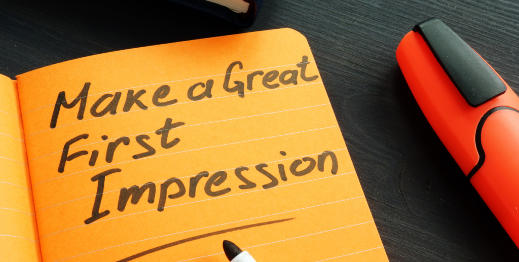
Why First Impressions Matter for Free-to-Play (F2P) Games

First impressions are critical for F2P games as they significantly influence a player’s decision to stay engaged. In the competitive world of free-to-play games, users can enter and exit games with minimal investment, meaning developers must capture their attention quickly to minimize player churn. Here’s an analysis of why first impressions are so important and what aspects of F2P games contribute to a positive initial experience.

The Power of Initial Impressions in Games

People make snap judgments about experiences, whether it’s meeting someone new or starting a game. Research shows that these decisions occur in milliseconds, often based on subconscious cues. In the context of F2P games, where players haven’t invested financially, their decision to stay or leave happens almost instantly. The goal is to convert the initial curiosity into genuine interest before users even begin playing.

For paid games, players often have an incentive to persist through initial hurdles to get their money’s worth. In contrast, F2P games can lose players immediately without financial loss to the player, creating a high churn rate that directly impacts the developer’s bottom line.

Key Design Elements for Positive First Impressions

  1. Intuitive Usability:
    • Usability shapes a player’s initial feelings about a game. F2P games should be instantly accessible, as complex or frustrating signup processes may lead to immediate exits. Players expect seamless onboarding; any delays or confusion can create frustration that taints their overall impression.
    • Simplifying sign-up and navigation by designing with basic usability principles in mind—such as clear calls to action and straightforward navigation—can create a positive experience even before gameplay starts.
  2. Clear and Engaging Sign-Up:
    • The sign-up experience is a player’s first interaction with an F2P game, and research indicates that users typically decide within 20 seconds if they’re interested. Designing a clear, engaging, and efficient sign-up process is crucial to retaining potential players, and the entire process from landing on the page to starting the game should be achievable in under a minute.
    • Making information on game features easy to find, minimizing text, and ensuring that visuals are attractive yet not overwhelming can help players make quick decisions to proceed.
  3. A Familiar Yet Appealing Aesthetic:
    • The first impression of a game’s visual design can determine whether a player even engages. Games with recognizable design patterns help players feel comfortable and in control, reducing the cognitive load and allowing them to focus on gameplay rather than on understanding the interface.
    • While creativity is key, familiarity is essential. Players prefer games that strike a balance between innovation and familiar interfaces.
  4. The Halo Effect:
    • The “halo effect” refers to the tendency of an initial impression to color a player’s entire experience. A positive first impression leads players to seek confirmation of that positivity throughout the game, while a negative impression prompts players to look for flaws. Creating a strong initial experience that aligns with expectations can increase the likelihood that players will view the game favorably as they progress.

Designing for an Engaging Initial Gameplay Experience

  1. Early Gameplay as an Engagement Hook:
    • The first minutes of gameplay should be smooth and free of confusion. This is not about making the game “easy” but about ensuring players understand the core mechanics and purpose of the game. Games that can integrate tutorials seamlessly into gameplay, like Portal 2 or Plants vs. Zombies, engage players without interrupting the flow.
    • Removing friction in tutorials and guiding players through core mechanics in an engaging way helps build a connection, encouraging players to continue.
  2. Avoiding Annoyances:
    • Players can be deterred if they feel uncomfortable, pushed too quickly, or if gameplay is overly directed. This could be comparable to someone standing too close in real life; it feels uncomfortable, leading players to abandon the game before fully experiencing it.
    • Providing players the freedom to explore without immediately hitting monetization walls or in-app purchase prompts can help them feel more welcomed and less pressured.
  3. First Impressions Influence Long-Term Retention:
    • While no game is perfect, creating a smooth and engaging initial experience can foster a sense of attachment. Players who feel more invested are less likely to quit when they face difficulties later. For F2P games, where monetization depends on retention, establishing early connection and interest is essential for both engagement and profitability.
  4. Monitoring and Adjusting Onboarding:
    • Just as games evolve, so too should the onboarding experience. Regular testing and refinement of the initial experience can help keep the experience fresh, relevant, and competitive. For instance, if loading times increase due to game updates or patches, developers might consider optimizing or streamlining downloads to avoid player frustration.

Conclusion

Creating a captivating first impression is essential for F2P games. A seamless onboarding experience, intuitive usability, and an appealing, familiar aesthetic can make all the difference in player retention. Through intentional design choices and regular adjustments, F2P developers can reduce churn and foster a positive initial experience that encourages players to stay and explore.


Business Needs & UX Design

Integrating Business Strategy into the UX Design Process

To design successful digital interfaces, a balance between user needs and business goals is crucial. User experience (UX) is often perceived as user-centric, but to make an impact, UX must be business-driven. This article explores how a Business-Driven UX Process can create a seamless connection between business strategy and UX design.

Understanding the Role of Business Goals in UX

In the current digital landscape, creating a user-friendly interface is the foundation of UX design. As the Nielsen Norman Group states, the core of good UX is meeting user needs. Yet, not all design decisions are user-focused. For instance, ads are intrusive for many users, but they’re lucrative for businesses. Similarly, features like Twitter’s character limit or TikTok’s video length limitations cater to business strategies rather than user preferences. While user needs are essential, aligning UX with business objectives is critical for success.

Bridging Business and UX Teams

UX designers may find business goals restrictive, and business leaders may view UX methods as costly. Effective UX design should be a middle ground where business strategy and user needs complement each other. To foster collaboration, it’s essential to define the roles of each department in the design process:

  1. Business Department: Defines the business strategy, including goals, mission, and target market.
  2. UX Department: Designs the user experience based on user needs to achieve business goals.

The Business-Driven UX Process

To align UX with business strategy, the Business-Driven UX Process offers a structured framework, combining user needs with strategic objectives at every design stage.

Stage 1: Business Strategy

The UX department should start by understanding the business strategy, even if it’s not their role to define it. A well-defined strategy goes beyond vague goals like “increase conversions” or “improve UX.” Specificity is key:

  • Business Goals: These should be measurable, challenging, and time-bound.
  • Mission Statement: A short, action-oriented declaration of the company’s purpose.
  • Target Market: Detailed segmentation, ordered by importance or profitability.
  • Forecasting: Goals should include short, medium, and long-term projections.

Other valuable strategic tools include SWOT analysis, competitive analysis, and the business model canvas. Clearly defined goals set the foundation for an evidence-based design that aligns with business needs.

Stage 2: Research

Research should be guided by both business objectives and user needs. Start with business-driven methods specific to your goals, such as:

  • Competitive Analysis
  • Call Center Report (common customer inquiries)
  • High-Profit Margin Products Report

After addressing business-driven needs, incorporate user-centric methods like:

  • Personas
  • Task Analysis
  • Journey Mapping

The sequence of methods should be based on the reliability of the information. For example, start with data-rich reports and move to qualitative insights like personas if they’re based on assumptions.

Stage 3: Define

The “Define” stage begins with the UX Strategy, a plan that translates business challenges into actionable UX solutions. For instance, a goal to reduce support ticket volume might be addressed by adding “Was this helpful?” surveys on help pages or optimizing the FAQ section. This stage also includes creating initial specifications for UX:

  • UX Roadmap
  • User Stories
  • Information Architecture
  • Design Specifications

Accessibility standards should also be outlined in this stage.

Stage 4: Design

The design stage encompasses creating the user interface, from wireframes and prototypes to visual and content design. Each design choice should be documented in the “Define” stage to streamline development. This stage is complete when all necessary documentation is ready. For instance:

  • Wireframes: Essential for planning layout and interactions.
  • Design System: Ensures consistency across products.
  • Content Writing: Tailors messaging to the target audience.

Designing with accessibility guidelines in mind is essential, and various tools are available to verify color contrast, font size, and other elements.

Stage 5: Evaluate

The evaluation stage measures both user satisfaction and business success. It’s a continuous process, focused on key objectives using both qualitative and quantitative methods:

  • Qualitative Methods: Usability testing, session recordings, and eye-tracking.
  • Quantitative Methods: Analytics reviews, A/B testing, heatmaps, and UX surveys.

Accessibility evaluations and page speed testing should also be conducted during this stage. This evaluation phase provides feedback that drives further iterations, feeding back into earlier stages if needed.

Key Takeaways

  1. Establish Roles: Define each team’s role in the Business-Driven UX Process to maximize collaboration and stakeholder buy-in.
  2. Collect Business Insights: Ensure you have a clear understanding of goals, mission, and target market.
  3. Research and Document: Begin with business-driven methods, followed by user-centric ones. Document findings to maintain alignment.
  4. Design with Clarity: Create and update UX documentation for streamlined development.
  5. Evaluate and Iterate: Use a structured evaluation plan to measure success, balancing business outcomes with user needs.

By implementing a Business-Driven UX Process, you create a design that meets both user needs and strategic goals, fostering a harmonious and profitable approach to UX.

4o

User Centered Design in Interactive Narrative Design

In game development, the question often arises: are games a storytelling medium? Some industry voices argue that games shouldn’t be viewed as vessels for narrative. But as a game designer deeply involved in crafting user experience, I firmly believe that games are indeed narrative vehicles. The role of the designer is to create not only gameplay but a story architecture—a structure that invites players to engage in meaningful, interactive experiences.

The Convergence of Design and Narrative: It’s Not Either/Or

Too often, game design and narrative design are viewed as two distinct crafts, each defending its own territory. However, great games, from Assassin’s Creed to Halo, show that story and gameplay are deeply interconnected. Elements like setting, perception, and character action weave both play and narrative together, forming the foundation of an engaging experience. Gameplay and narrative aren’t opposing forces—they’re two sides of the same coin.

Interactive Narrative Design: Collaborating Across Disciplines

Embracing an interactive narrative design approach means blending the strengths of game design with the power of storytelling. As new generations of designers—who grew up playing immersive games like Grand Theft Auto and Halo—enter the field, they bring a natural fusion of gameplay and story. These designers aspire to build games that are more than just actions and outcomes; they want to create a “dance” of meaning, form, and narrative.

Disney Imagineers have been doing this for years in their theme parks. They create spaces that are not only fun but deeply resonant with story elements. These experiences are thoughtfully designed with one goal in mind: connecting with people in ways that make them feel joy, wonder, and adventure. Game designers can learn from this approach by thinking about games not as a series of mechanics but as places where players can feel truly immersed in a narrative.

Game Design and Narrative Design: A Shared Foundation

In crafting user experiences, game developers must first understand the shared elements between design and narrative. Both fields rely on a foundation that includes:

  • Place and Setting: Every game has a world, whether it’s a realistic urban landscape or a fantastical realm.
  • Perception and Choice: Designers and writers both guide how players see and interact with the world.
  • Action and Reaction: Choices in games, like plot points in a story, have consequences, leading players down different paths.

When you build a game with these elements in mind, you’re creating a world where gameplay and story intertwine naturally, and each choice a player makes contributes to the narrative.

Designing for User Experience: A Narrative-Centric Approach

Good game design starts with clear goals for the user experience. What do you want players to feel? What do you want them to remember? These questions form the core of narrative-centric design—a design philosophy focused on aligning every gameplay mechanic, story beat, and visual element with the desired experience.

Here’s an approach to integrating narrative into game design:

  1. Define the Core Experience: Begin with the emotions and reactions you want players to have. This vision should guide all creative decisions.
  2. Merge Mechanics and Story: Actions in the game should feel like a natural part of the story. For example, in BioShock, the mechanics of choosing powers and facing moral choices are deeply tied to the game’s narrative themes.
  3. Design for Choice and Consequence: Every action should impact the narrative in some way, allowing players to feel that their choices shape the world.

By aligning gameplay with story, you make every element of the game contribute to the overall narrative. The result? A cohesive, immersive experience where players feel that they’re not just following a story—they’re creating it.

Building User Stories: Encouraging Player Agency

Interactive narrative design is ultimately about player agency. The goal is for players to leave the game with a story of their own. “I did X and Y, and then this amazing thing happened.” When designers create opportunities for players to engage deeply, the narrative becomes personal.

Some methods for promoting player agency include:

  • Dynamic World Building: Allow the environment to react to player actions. For instance, in an RPG, if a player saves a village, they might receive a hero’s welcome when they return later in the game.
  • Character Choice and Development: Give players control over how their character evolves. Mass Effect did this by allowing players to make choices that impacted relationships, alliances, and even the game’s ending.
  • Interactive Story Arcs: Design the game so players can take different paths based on their decisions, creating unique storylines.

When players feel their actions influence the game’s outcome, they’re more likely to become invested, making the narrative a part of their experience.

Tools and Techniques for Building Interactive Narratives

Today, designers can access a variety of tools to build interactive narratives, even on limited budgets. Free tools like Twine or GameMaker allow solo developers or small teams to create immersive experiences. With determination and creativity, designers can build complex, engaging worlds that invite players to explore and craft their own stories.

Some resources and techniques include:

  • Narrative Engines: Use systems like Ink or Yarn Spinner to handle branching dialogues and decision-based storytelling.
  • Storyboarding and Mapping: Plan storylines with visual tools, mapping out potential choices and consequences.
  • User Testing and Feedback: Testing narrative-heavy games is crucial for understanding how players experience the story. Observing user reactions helps refine the narrative and ensure it aligns with player expectations.

The Future of Game Narratives: Breaking Down Boundaries

We need to break free from rigid roles and embrace multidimensional thinking. Whether working in FPS, RPG, or casual mobile games, narrative should be a driving force that blends seamlessly with design. Game developers, writers, designers, and artists all have roles to play, but the boundaries between these roles shouldn’t limit creative collaboration.

Imagine a game where players experience a richly woven story through their own actions. They’re not just playing—they’re creating moments that are deeply personal, memorable, and impactful. The future of gaming lies in creating experiences that resonate beyond the screen, allowing players to cross the line between reality and imagination.

Final Thoughts: Making Interactive Storytelling the Norm

As game developers, we’re here to craft immersive experiences that reach beyond simple gameplay. This isn’t about “winning” a debate on whether games are a storytelling medium. It’s about creating games that are naturally storytelling mediums, where mechanics, narrative, and user experience come together to craft something unforgettable.

By embracing narrative design, we can make games that not only entertain but engage players on a personal level. The stories they tell after playing become a testament to the power of games as an interactive storytelling medium, leaving a lasting impression. In the end, the narrative is what players carry with them—an adventure they created, shaped by every choice and every action they took along the way.

Why UI & UX Designers Should Understand Flexbox and CSS Grid

Many designers are familiar with responsive design, often framed around a column-based grid with fixed breakpoints for different screen sizes. But modern CSS layout techniques, particularly Flexbox and CSS Grid, allow for more flexibility, moving beyond traditional grid systems to create adaptable designs. Understanding these tools doesn’t mean designers need to code; it’s about improving collaboration with developers and embracing a shared language around layouts.

Let’s explore the value of Flexbox and CSS Grid, compare traditional and modern layout approaches, and examine how learning these CSS tools benefits UI designers.


From Fixed Columns to Flexible Layouts: Why Change?

Column-based grid layouts have long been the foundation for responsive web design. They allow designers to create a structured layout using fixed breakpoints to adapt across screen sizes. However, these traditional grids rely heavily on external factors—like viewport width changes—to determine layout adjustments, often resulting in rigid designs.

Modern CSS tools like Flexbox and CSS Grid shift the focus. Instead of merely reacting to viewport changes, these layouts respond dynamically based on content and available space, a concept known as “intrinsic design.” This approach allows designers to blend fixed and flexible elements, creating more seamless experiences across devices and screen sizes.


Flexbox: A One-Dimensional Layout Solution for Components

CSS Flexbox (short for Flexible Box Layout) is designed to arrange items in a row or column. Flexbox’s simplicity makes it ideal for organizing UI components and elements within a layout. Flexbox works with two main elements:

  • Parent Container (Flex Container): The container where you apply display: flex; to activate Flexbox. This parent element sets the rules for the items it contains, determining layout direction (row or column), alignment, and spacing.
  • Child Elements (Flex Items): The individual elements inside the container, which can be controlled individually for growth, shrinkage, and alignment, giving designers flexibility for how each component behaves within the larger layout.

Practical Example: In a card layout, Flexbox can arrange an image, title, and description in a row or column. Nested Flexbox containers allow for even more complex setups, like a navigation bar with different alignment needs.

Tip: Figma’s Auto Layout feature is based on Flexbox principles, so understanding Flexbox can enhance how designers use tools like Figma for responsive component design.

CSS Grid: A Two-Dimensional Layout Solution for Full Layout Control

CSS Grid goes a step further, offering two-dimensional control (both rows and columns) to create more complex layouts. Unlike Flexbox, which is limited to one direction, CSS Grid is ideal for creating overall page structures and aligning elements precisely within rows and columns.

In CSS Grid, layout is controlled through gridlines rather than columns, which provides more granular control for positioning elements. Designers can create grid areas and even overlap items without requiring code adjustments.

Practical Example: A homepage layout with a header, sidebar, and main content area can be set up using CSS Grid. Nested grids allow designers to structure each section individually, providing even more control over the layout.


Bridging the Gap Between Flexbox and CSS Grid

Designers often wonder if they must choose between Flexbox and CSS Grid. The answer is no—these tools complement each other beautifully. Flexbox is excellent for smaller UI components that require straightforward, linear layouts, while CSS Grid is suited for entire page structures and complex layouts.

Common Practice: Use CSS Grid for the overall layout and Flexbox within individual components. For example, the main sections of a website might be arranged with CSS Grid, while the contents of each section (like navigation links or content cards) could be handled with Flexbox.


Moving Beyond Fixed Breakpoints: Fluid Layouts with Modern CSS

Traditional column-based layouts rely on fixed breakpoints to adapt to screen sizes. While breakpoints are still useful, modern CSS techniques like container queries and CSS clamp enable more fluid adjustments that don’t require fixed points.

  • Container Queries: Rather than adjusting layout based solely on the viewport size, container queries adapt based on the size of the container itself, allowing components to adjust flexibly within a layout.
  • CSS Clamp: This feature allows designers to set minimum, maximum, and flexible values, which is particularly useful for fluid typography.

With these tools, breakpoints become less rigid, allowing for a more seamless adaptation across devices.


The Benefits of Understanding Flexbox and CSS Grid for Designers

  1. Enhanced Collaboration: Knowing how Flexbox and CSS Grid work means designers can speak the same language as developers, making handoffs smoother and more precise.
  2. Improved Creativity: With modern CSS, designers can push beyond traditional layouts, creating more dynamic and adaptive experiences.
  3. Greater Autonomy in Design Tools: Tools like Figma’s Auto Layout mirror Flexbox principles, allowing designers to set up components that resemble real-world web layouts, improving design accuracy.
  4. Confidence in Design Decisions: Understanding layout capabilities enables designers to make choices that align with both creative vision and technical feasibility, resulting in designs that are more realistic and achievable.

Flexbox and CSS Grid: Key Concepts to Understand

Flexbox Basics

  • Main Axis vs. Cross Axis: Flexbox arranges items along the main axis (horizontal or vertical), while the cross-axis controls alignment perpendicular to the main axis.
  • Alignment and Spacing: The parent container controls spacing (like justify-content for main axis alignment) and item arrangement.
  • Nesting: Complex layouts may require nested Flexboxes for components with multiple alignment needs.

CSS Grid Basics

  • Grid Lines and Cells: Instead of columns, CSS Grid uses grid lines to define placement, allowing for more flexible positioning.
  • Grid Areas: CSS Grid allows for the creation of grid areas, providing structured zones within the layout.
  • Fractional Units (fr): With fr units, designers can specify how space should be distributed across cells.
  • Explicit vs. Implicit Grids: Explicit grids are pre-defined by designers, while implicit grids adapt based on content.

When (and Why) to Use Breakpoints with Modern CSS

While modern CSS layouts reduce reliance on breakpoints, they are still helpful for specific changes:

  • Major Layout Changes: Use breakpoints for substantial layout shifts, like changing a two-column layout to a single-column on smaller screens.
  • Component Adjustments: Breakpoints can also be used for component adjustments, like switching from a burger menu to a horizontal navigation.
  • Typography Scaling: For typography, CSS clamp can handle many adjustments, but fixed breakpoints may still be used for consistent scaling across screens.

It’s Not About Coding—It’s About Understanding

The goal for designers isn’t to become front-end developers but to understand the tools developers use. This shared understanding fosters stronger communication, makes handoffs easier, and ultimately leads to better design outcomes. With an awareness of CSS limitations and possibilities, designers can make smarter, more collaborative choices, leading to designs that translate more seamlessly into the final product.


Conclusion: From Rigid Columns to Dynamic Layouts

Modern CSS layouts open new doors for UI designers to create adaptable and dynamic experiences. Flexbox and CSS Grid each bring unique strengths, from organizing simple components to designing complex, multi-dimensional layouts. By understanding these tools, designers can communicate more effectively with developers, navigate design decisions confidently, and embrace a more flexible, user-centered approach to layout.

As UI designers, learning the fundamentals of CSS isn’t about taking on coding responsibilities; it’s about enriching the creative process and fostering collaboration. Embrace the potential of Flexbox, CSS Grid, and modern CSS—it’s a move toward more fluid, resilient, and innovative design.

The HEART Framework: Measuring UX Success with Purpose

Design changes are often accompanied by heated debates and subjective arguments. Statements like, “I don’t think this will work” or “I don’t like it” are common in design discussions, and while A/B testing might seem like the solution, it’s crucial to first know what metrics truly matter. The HEART framework, developed by Google, helps bridge the gap between design intuition and measurable impact by providing structured, actionable metrics for UX improvements.

This article explores how the HEART framework can support a data-driven design process, empowering designers to confidently present the impact of their work.


Why Metrics Matter in Design

Improving UX should always be measurable. If it’s not, we need to question the change, as it becomes nearly impossible to determine its success or failure. When teams aren’t aligned on what to measure, design decisions risk being vague and subjective. Enter the HEART Framework and the Goals-Signals-Metrics (GSM) process, two methods developed by Google to clarify UX goals and link them to meaningful metrics.

Understanding the HEART Framework

The HEART framework breaks down the user experience into five measurable areas:

  1. Happiness
  2. Engagement
  3. Adoption
  4. Retention
  5. Task Success

Each area is approached by setting specific goals, identifying signals that indicate progress, and establishing metrics to measure success.

1. Adoption

Adoption focuses on new user uptake—how many people use a feature or product for the first time. It reflects the initial appeal of a feature and how well it aligns with user needs.

  • Goal: Increase user interest in a new feature.
  • Signal: Users register for an account or activate a new feature.
  • Metrics: Download rate, registration rate, feature adoption rate.

For instance, if you’re running a course for designers and tracking conversion rates, the adoption metric would indicate how many visitors sign up after visiting your landing page.

2. Task Success

Task success measures how effectively users complete tasks within your product, focusing on efficiency and accuracy.

  • Goal: Users can complete tasks without unnecessary frustration.
  • Signal: High task completion rates and low error rates.
  • Metrics: Error rate, time to task completion, task completion rate.

For a course platform, task success could include tracking completion rates or the time users take to complete lessons. In a blog, you might track how many readers scroll to the end of an article and how long they take.

3. Engagement

Engagement reflects the frequency and depth of interaction with your product. High engagement can indicate that users find value and enjoyment in your product.

  • Goal: Increase interaction with content or features.
  • Signal: Users visit frequently and explore multiple sections.
  • Metrics: Pageviews, visit frequency, average session duration.

If you track engagement on a website, you might monitor how often users return within a set period or the open rate of your email newsletters.

4. Retention

Retention tracks users who return to your product over time. It’s an indicator of sustained interest and satisfaction, reflecting the long-term value of your offering.

  • Goal: Encourage repeat visits and long-term usage.
  • Signal: Users return regularly after their initial experience.
  • Metrics: Retention rate, churn rate, repeat usage frequency.

In a mobile app, for example, retention could be measured by the percentage of users who continue using the app after 30 days.

5. Happiness

Happiness captures user satisfaction and perception of your product. Measuring happiness often involves surveys and feedback tools to gauge user sentiment.

  • Goal: Users feel positive about their experience.
  • Signal: Users report high satisfaction and ease of use.
  • Metrics: Net Promoter Score (NPS), satisfaction ratings, survey feedback.

The Net Promoter Score (NPS) is a widely used metric to measure happiness, assessing how likely users are to recommend your product to others on a scale of 0-10. High scores reflect strong user loyalty and satisfaction.


Using the HEART Framework with the GSM Process

The Goals-Signals-Metrics (GSM) process complements the HEART framework by structuring each metric around specific goals, signals, and quantifiable data points. Here’s how GSM aligns with the HEART framework:

  1. Define Goals: Start with broad objectives. For example, a goal for “Happiness” might be, “Users find the app intuitive and helpful.”
  2. Identify Signals: Set indicators of progress. In the case of “Happiness,” this might be, “Users recommend the app to friends.”
  3. Establish Metrics: Pin down quantifiable metrics to track success. For the above example, this might be “number of referrals” or “average NPS rating.”

This layered approach ensures that metrics are tied to meaningful outcomes, creating alignment across design and business objectives.

The Designer’s Advantage: Measurable Impact

The HEART framework not only improves UX outcomes but also serves as a powerful tool for designers to demonstrate their impact. Design decisions backed by data speak volumes in business settings, enabling designers to clearly show how their work drives value.

Example: During a performance review, instead of subjective claims about design quality, a designer could present metrics demonstrating a 20% increase in conversion or a 40% reduction in error rates. Business stakeholders often appreciate metrics that translate into real-world improvements, from increased user engagement to reduced churn.

A Strategic Approach: Ordering Metrics by User Journey

While the acronym HEART is easy to remember, it may be beneficial to reorder the metrics for brainstorming and strategic planning according to the user journey:

  1. Adoption: The initial user onboarding or feature adoption.
  2. Task Success: The ability for users to achieve their intended outcomes.
  3. Engagement: The depth and frequency of user interaction.
  4. Retention: Users returning and continually engaging with the product.
  5. Happiness: Users’ overall satisfaction and positive perception.

This order aligns with a typical customer lifecycle, making it easier to analyze user behavior step-by-step.

Summary

The HEART framework and GSM process bring structure to design discussions, enabling product teams to ground design changes in measurable outcomes. By incorporating metrics, designers can elevate their work beyond aesthetics, showing the tangible value they bring to the user experience. Not only does this foster a more effective design process, but it also positions designers to communicate their impact in business terms.

By focusing on data, we can make design decisions that are strategic, impactful, and aligned with real user needs. When we measure, we don’t just improve — we ensure that our improvements matter.

Using Personas to Understand Player Behavior

Watching someone play a game you’ve worked on can be a rollercoaster. You might think, “Why won’t they use that weapon I designed?” or “Why aren’t they reading the story text?” Frustrations like these are common, but there’s a solution that could transform this experience from painful to productive: embracing personas.

Personas, a concept introduced by Alan Cooper in The Inmates Are Running the Asylum, can help us understand different types of players. Personas go beyond demographics like age or location; they bring specific player motivations, preferences, and playstyles into focus. Adopting personas allows game designers to anticipate different behaviors, align with player needs, and create better gameplay experiences.

The Power of Personas in Game Design

Using personas helps game designers visualize the different types of players they are creating for. This foresight is especially useful during the early stages of game design, preventing the need for extensive changes once the game reaches testing.

For example, consider a classic sniper level like “All Ghillied Up” in Call of Duty: Modern Warfare. The designers created an immersive, slow-paced experience that required players to remain stealthy. If they’d had a persona like “Speedrun Sam” in mind, they could have anticipated the need for pacing adjustments to ensure Sam stays engaged. Similarly, a persona like “Shoot First Shawn” could have guided designers to keep enemies out of sight until the right moment, ensuring players don’t accidentally break the intended gameplay flow.

Creating Your Personas

Developing personas doesn’t have to be complex. Start by considering your players’ playstyles, motivations, and frustrations. Here’s a basic framework to build on:

  1. Name – Be descriptive and memorable. Names like “Speedrun Sam” or “Narrative Nancy” can bring personas to life.
  2. Age – Choose a representative age range or specific number that aligns with your target demographic.
  3. Photo – Find a stock image or illustration that visually represents the persona.
  4. Motivations – Describe how this persona plays, what interests them, and what they find frustrating in games.

Here are some sample personas:

  • Speedrun Sam, 19
    Sam’s goal is efficiency. He skips text, cuts corners, and speeds through every game as quickly as possible. If he encounters a mechanic that slows him down, he’s likely to get frustrated.
  • Narrative Nancy, 26
    Nancy loves story-driven games and details. She reads every bit of lore, appreciates world-building, and prefers a slower pace to take in the experience. She’s not in it for trophies but to immerse herself in the game’s universe.

When you create personas specific to your game, get the entire team involved. Collective input fosters a shared understanding, ensuring these personas resonate throughout the development process.

Leveraging Personas in Development

Once you’ve established personas, make them a core part of your design discussions. Post them in visible areas or keep digital versions handy. Ask yourself, “What would Speedrun Sam do here?” or “Is Narrative Nancy going to enjoy this sequence?”

Remember, personas are a tool, not a constraint. Not every design element needs to cater to every persona, nor should you overburden the team by creating too many personas. Identify key personas that align with the primary experience you want to create.

Updating Your Personas

Personas should evolve with your game and audience. As new games release and genres expand, player expectations shift. Revisit your personas periodically, especially after playtesting. Adjust them based on new insights, put some in “cryo-sleep” if they’re not currently relevant, and tweak others to reflect emerging player behaviors.

By keeping personas fresh and relevant, you ensure that your design remains player-centered. The more you understand your audience, the better your chances of creating an experience that resonates with them.

In Conclusion

Personas bring player motivations and behaviors into clear focus, helping you design with specific players in mind. Whether you’re creating a high-tension stealth level or a story-driven quest, personas provide a compass to keep your design aligned with user expectations. Embrace this tool, and you’ll find your game feels more engaging and authentic to the players who experience it. When you care about your players’ needs, they’ll care about your game.

Analytics & UX Design

Using Google Analytics as a Powerful UX Tool

Google Analytics (GA) is typically thought of as a tool for measuring web traffic and marketing performance, but its potential as a UX tool is often overlooked. With a user-friendly interface, extensive data insights, and minimal developer intervention after initial setup, GA can provide invaluable support for UX designers and researchers.

This article unpacks practical ways to use GA for UX, with tips on getting started and leveraging specific features for user research, journey analysis, and A/B testing. Let’s dive into how GA can enhance your UX approach.

Getting Started with Google Analytics for UX

GA’s standard version is free and can be installed on any web-based or native app. Simply set up an account, add your tracking code, and open your website in the “Real Time” section of GA to start seeing live user activity.

Key Metrics and Dimensions for UX

GA’s metrics and dimensions offer a wealth of data on user behavior. Dimensions describe attributes of your visitors, like their age, while metrics measure these attributes, like the number of times a page was viewed.

Useful UX Metrics

Some metrics can provide valuable insights into user experience:

  • Demographics: GA gives access to demographic data like age, gender, and location, helping UX designers understand their audience. However, keep in mind that this data is only collected for users logged into Google.
  • Device and Browser Usage: Knowing the devices, operating systems, and browsers your users prefer can guide responsive design efforts and ensure cross-platform compatibility.
  • Time on Page: Indicates user engagement on a particular page or screen. A high time on page could suggest valuable content, while a low time might indicate layout or content issues.
  • Session Duration: Measures how long users stay on your site per visit. Combine this with bounce rate or exit rate for insights into the effectiveness of user journeys.
  • User Journey: Metrics like “Landing Page,” “Page Depth,” and “Next Page Path” reveal where users enter, how deeply they navigate, and the paths they take, offering a window into how intuitive your site structure is.

Site Speed Insights

Page load speed is a critical UX factor. GA’s “Site Speed” metric helps you track the performance of your site by browser and page. Google uses an average sample for these measurements, which can provide an overall view of speed but may not reflect every user’s experience.

Tip: Use speed data qualitatively to identify high-level performance issues, as one slow load time could skew your averages.

Understanding User Intent with Google Ads, Search Console, and Site Search

Connecting GA with Google Ads and Search Console unlocks new user intent data that can bridge UX and marketing efforts. Features like “Search Query” reveal terms users searched to reach your site, providing insights into user needs and interests. Combining search queries with session duration and bounce rate can reveal if users found what they were looking for.

Example: A user searching for a specific feature may indicate a product interest or need. Analyze their subsequent journey to see if they engaged with related content, helping you adjust UX to better meet user intent.

Events: Tracking Interactions for Deeper Insights

Events in GA are highly customizable, allowing you to track any interaction a user takes within your app or site. Events are composed of three dimensions:

  • Category: Groups events into types (e.g., “Forms” or “Navigation”).
  • Action: Describes the action taken (e.g., “Click” or “Scroll”).
  • Label: Adds context to the action (e.g., “Submit Button”).

UX Applications for Events

Examples of events that provide UX insights include:

  • Scroll Depth: Understand whether users reach the end of a page, highlighting potential layout issues.
  • UI Interactions: Track interactions with elements like buttons, menus, or banners, helping gauge the effectiveness of key UI components.
  • Form Interactions: Identify where users encounter issues in forms, from field validation to submission.
  • Content Engagement: Measure how users interact with specific content sections, combining time on page with scroll depth.

Note: While events need to be set up manually, using Google Tag Manager can make event tracking easier and scalable.

Analyzing User Flow and Behavior

GA includes several tools that help UX designers understand how users navigate their sites or apps:

  • Navigation Summary: Shows where users came from and where they went next, allowing you to see if users flow as intended.
  • Behavior Flow: Provides a visual representation of user paths through the site. Although this view doesn’t show every single page, it gives a broad overview of major navigation trends.
  • User Explorer: Offers a detailed view of individual user journeys, including session details and triggered events, based on a cookie ID. While limited by device-dependence, this feature offers granular data for analyzing user behavior patterns.

Custom Dimensions: Extending GA’s Data Capabilities

Sometimes you need data beyond GA’s default metrics. Custom dimensions allow you to capture unique data points from any user interaction. For example, you could set up a custom dimension to track user marital status if relevant to your product’s experience.

Setting Up Custom Dimensions

Identify the data you need and create events that capture it, like marital status selection in a form. Once set, custom dimensions can be analyzed alongside default metrics, providing richer insights.

Testing UX Hypotheses with Google Optimize

GA’s integration with Google Optimize facilitates A/B testing and personalization, allowing you to test UX variations directly within your site without altering the code. Optimize offers four types of experiments:

  1. A/B Test: Test two or more variants, adjusting traffic distribution.
  2. Multivariate Test: Test different combinations of changes to identify the best combination.
  3. Redirect Test: Send traffic to different URLs for comparison.
  4. Personalization: Customize the experience for specific user groups.

Optimize’s visual editor simplifies testing, letting you modify content, styles, and elements for users who meet specific criteria. You can track test results in GA to see which version yields the best outcomes.

Presenting UX Insights with Data Studio

Once you’ve gathered valuable insights from GA, presenting your findings is the next step. Google Data Studio is a free data visualization tool that integrates with GA, allowing you to customize reports and create visuals for easier data interpretation.

Example: A Data Studio dashboard might feature graphs on session duration, heatmaps of user flows, and event interactions, providing a comprehensive look at user behavior.

Conclusion: Google Analytics as a UX Ally

Google Analytics offers a powerful toolkit for UX designers. From understanding user demographics to tracking detailed interaction events, GA enables data-driven decisions that can enhance the user experience. Remember that GA gives you data, but it’s up to you to derive actionable insights. When combined with tools like Google Optimize and Data Studio, GA becomes an indispensable part of any UX designer’s toolkit, helping you craft experiences that better align with user needs.

Building a UX Strategy That’s User Centered

Building a User-Centered UX Strategy: Essential Tools and Frameworks

Before diving into the design phase with prototypes, sitemaps, or wireframes, it’s critical to ask the right questions to shape a product aligned with users’ needs and business goals. Effective UX design puts the user at the core of every decision. This user-centered approach improves interactions with your brand by incorporating insights from user emotions, behaviors, and desires.

Yet, many companies bypass research, relying on assumptions or intuition about user behaviors. A comprehensive understanding of the target audience, however, can elevate UX to a strategic asset. Here’s how to establish a well-rounded UX strategy using essential frameworks and tools to align user experience with broader business objectives.

Step 1: Organize with a UX Strategy Framework

A UX strategy framework provides a structured approach to the UX process, enabling designers to break down complex ideas and map them towards project goals. The framework typically involves four stages:

  1. Collect Problems: Identify challenges and user pain points through user research, interviews, and data analysis.
  2. Generate Solutions: Brainstorm and propose potential solutions to address these challenges.
  3. Prioritize Segments: Focus on high-impact areas based on user needs and business goals.
  4. Implement Ideas: Move forward with solutions, refining them through iterative testing and feedback.

Tools for Structuring Ideas

Popular tools for managing this flow include Kanban boards and the 360° View. Both help keep track of tasks, decisions, and user insights visually, creating a clear view of project progress.

  • Kanban Boards: Often seen in tools like Trello, Kanban boards visually organize tasks, from problem collection to implementation. Sticky notes on Kanban boards help prioritize tasks and facilitate team collaboration.
  • 360° View Diagram: This holistic tool incorporates three essential elements—user needs, business goals, and technological feasibility—into a unified view, enabling teams to evaluate opportunities where these elements intersect.

Step 2: Identify the User through Proto-Personas

Proto-personas are preliminary versions of personas that summarize key characteristics of your target audience. They outline the user’s demographics, needs, goals, and behaviors, providing a reference point during initial design phases.

Creating Proto-Personas

  1. Gather the UX team and brainstorm assumptions and observations about the target users.
  2. Develop a profile outlining core traits: name, age, goals, challenges, preferences, and habits.
  3. Group similar profiles and prioritize primary and secondary proto-personas.

Proto-personas can be refined as more data is gathered through interviews and surveys, ultimately evolving into fully developed personas based on validated insights.

Step 3: Blueprint Strategy for Mapping Experiences

A Blueprint Strategy maps out all points of contact between the user and the brand, including internal processes necessary to support these interactions. It provides a comprehensive view of the customer journey, revealing where improvements can be made.

Applying the Blueprint Strategy

To effectively use a UX Blueprint, break down the journey into several boards, addressing the following areas:

  • Challenges: Identify problems and obstacles to overcome.
  • Aspirations: Define desired outcomes and objectives.
  • Focus Areas: Prioritize which elements of the strategy will yield the greatest impact.
  • Guidelines: Outline principles to guide design choices and maintain consistency.
  • Activities: List tasks that support the achievement of aspirations.
  • Measurements: Establish metrics to evaluate the success of each stage.

The Blueprint Strategy encourages exploration and iteration. Cross off items, rearrange ideas, and return to challenges as necessary to refine your approach. This adaptable model keeps the UX strategy aligned with both user needs and business goals, creating a structured approach to mapping and improving the user journey.

Step 4: Visualize the User Journey with a Customer Journey Map

The Customer Journey Map is a step-by-step representation of a user’s interaction with your service. This visual tool outlines various touchpoints, motivations, and challenges along the journey, highlighting where users find value or encounter obstacles.

Building a Customer Journey Map

  1. Map Touchpoints: Identify every interaction users have with your product or service, from initial discovery to final engagement.
  2. Define Motivations: Understand what drives users at each stage and address pain points where users may lose interest.
  3. Analyze Flow: Evaluate the user’s movement through each stage, making improvements to smooth out navigation and reduce friction.

This process reveals what aspects of your product experience are working well and where improvements can be made, guiding refinements to increase user satisfaction.

Step 5: Conduct Stakeholder Interviews for Strategic Insights

Stakeholder interviews provide critical input from individuals who influence or approve various aspects of the product. This dialogue ensures that UX goals align with business objectives, helping prioritize features and functionalities that drive value.

Key Questions to Ask Stakeholders

  1. About the Product: What are the expectations and goals for this product? What concerns do you have?
  2. About Users: Who is the target audience? What problems will this product solve for them?
  3. Relationship with the Initiative: What role does each stakeholder play in the development process? Who else should we consult?
  4. Marketing Insights: How does the product fit within the company’s brand and identity?
  5. Practical Details: What are the timeline and technical constraints? Are there any previously made decisions we should be aware of?

These questions, adapted from Kim Goodwin’s Designing for the Digital Age, help ensure the product meets user needs while aligning with the company’s strategic direction. Collecting insights from various stakeholders also fosters buy-in, paving the way for collaborative success.

Integrate Feedback and Iterate

UX strategy is an iterative process that adapts based on feedback from user testing and stakeholder input. A successful UX design doesn’t just look good but aligns with user needs, business goals, and technical capabilities. Regularly reviewing and refining each element of the UX strategy ensures the product remains on track and adapts to evolving requirements.

Conclusion

Developing a strong UX strategy involves much more than building an aesthetically pleasing interface. It requires understanding users, defining clear business goals, and working within technical constraints. Through frameworks such as the Kanban Board, 360° View, Proto-Personas, Blueprint Strategy, Customer Journey Map, and stakeholder interviews, you can build a comprehensive, user-centered UX strategy. Engaging both users and stakeholders at each stage of the process not only brings clarity to project goals but also creates a solid foundation for user satisfaction and business success.

Thinking about the UX of Mini Maps in Games

Designing and Placing the Mini Map: Guidelines for Game Developers

The mini map is a staple in many game genres, providing players with essential information to navigate and interact with the game world. But where should it be placed on the HUD, and what factors should guide its design? This article explores conventions and best practices for mini map placement, including genre-specific trends and practical guidelines to create an effective, user-friendly mini map.

Why Do Games Need a Mini Map?

Mini maps offer orientation and help ease navigation within game worlds. They evolved alongside world maps, particularly in RPGs and adventure games, as a compact means of providing real-time spatial awareness. Though not all genres need mini maps—puzzle, board, fighting, and some adventure games often forgo them—they’re nearly indispensable in fast-paced games such as shooters, RPGs, MOBAs, and racing games. In these genres, the mini map acts as a player’s primary tool for situational awareness.

Common Mini Map Conventions Across Genres

To understand mini map placement, we analyzed a selection of 66 games. While no strict standard exists, some clear patterns emerge:

  • MOBA Games: Typically place the mini map at the bottom left.
  • Strategy Games: Usually prefer the bottom left, favoring players’ lower visual fields.
  • MMORPGs: Frequently use the top right for their mini maps.
  • Racing Games: Often position the mini map on the left side of the screen.
  • First-Person Shooters: Also prefer the left side.

Mini Map Scope and Design Variations

The mini map’s scope and presentation vary by genre. Action and shooter games generally limit the mini map’s view to the player’s immediate surroundings. Meanwhile, in sports, MOBA, and racing games, the mini map may encompass a broader view of the game world. In genres with larger virtual environments, mini maps often include cardinal directions and use circular frames, reflecting a compass metaphor that aids navigation.

Guidelines for Mini Map Placement and Design

When deciding where to place a mini map, it’s essential to consider both player usability and established conventions within the genre. Misplaced mini maps can cause player frustration and confusion, particularly in fast-paced games where quick access to HUD elements is crucial.

1. Optimal Placement

  • Left-Side Placement: Western players tend to focus more on the left side of the screen, making it ideal for games that require rapid decision-making.
  • Minimize HUD Distance: Avoid placing the mini map too far from other core HUD elements. This minimizes eye movement, reducing reaction times and missed clicks.
  • Divide Information and Interaction Zones: Position the mini map within a “pure information” zone of the HUD, typically in the top half of the screen. If the map allows player interaction, consider placing it closer to interactive HUD elements at the bottom.

2. Visual Consistency

  • Integrate with HUD Aesthetics: Ensure the mini map’s design complements the overall HUD layout in terms of proportions, colors, and style.
  • Avoid Obstructing Essential Gameplay Elements: Place the mini map in a way that doesn’t obscure critical gameplay visuals unless it’s toggleable.
  • Consider Iconography and Color: Use high-contrast colors for important elements like allies, enemies, and objectives. Account for colorblind accessibility by using distinctive shapes or textures.

3. Information Display

Mini maps provide essential information that players rely on for situational awareness. Here’s a breakdown of essential and optional elements:

  • Must-Have Elements:
    • Player Position: Central to helping players orient themselves within the game.
    • Friends and Enemies: Mark opposing players or units in clear, distinguishable icons.
    • Barriers and Obstacles: Use color contrasts (e.g., dark for obstacles, light for accessible areas) to highlight boundaries.
    • Points of Interest: Checkpoints, bases, objectives, and other strategic markers.
  • Optional Elements:
    • Fog of War: Common in strategy games to obscure unexplored areas.
    • Health or Status Indicators: Show unit or player health in games with survival elements.
    • Terrain Details: Use subtle shading for elevation or terrain differences.
    • Peripheral Indicators: For large maps, peripheral arrows or symbols can indicate the direction of off-screen points of interest.

Interactivity Options

For games that allow it, a mini map can go beyond passive display by providing interactive options. These features enhance usability and give players greater control over navigation and communication:

  • Setting Waypoints: Players can mark specific destinations by clicking on the mini map.
  • Pings or Alerts: Useful in multiplayer games, these allow players to communicate through “Target” or “Retreat” pings.
  • Zoom Controls: Allow players to zoom in and out, potentially transitioning to a full-scale world map.
  • Drag or Pan: For larger maps, players may need to drag or scroll to view different segments.

Recommendations for Effective Mini Map Design

  1. Use Established Conventions: Players often have genre-based expectations for mini map location. If your game belongs to a genre with common mini map conventions, consider using them to ease players’ learning curve.
  2. Ensure Scalability: In games with large worlds or changing environments, a scalable mini map that adapts to zoom levels or displays relevant information based on player progression is essential.
  3. Prioritize Readability: A mini map should communicate key information at a glance. Opt for simple, recognizable icons over detailed illustrations to reduce cognitive load.
  4. Leverage Known Metaphors: Use universally understood icons—houses for bases, flags for checkpoints—to communicate game elements. When in doubt, simple geometric shapes (dots, arrows) are preferable to abstract symbols.
  5. Support Peripheral Awareness: Fast-paced games, particularly in the action and shooter genres, benefit from positioning the mini map within the player’s peripheral vision, reducing the need for direct eye contact and increasing reaction time.

Closing Thoughts

The placement and design of a mini map might seem trivial, but it plays a significant role in a player’s experience. By considering genre conventions, integrating design within the HUD, and ensuring clear readability, game designers can create mini maps that enhance rather than hinder gameplay. Thoughtful mini map design not only supports player orientation but also contributes to an overall immersive experience that keeps players engaged and fully aware of their surroundings.

Hiring Designers by Archtypes

Staffing Designers for Success: Using the Visionary, Cultivator, and Architect Archetypes

Assigning designers to projects that align with their strengths is essential for project success and team morale. Borrowing a model from the world of sales and adapting it for design, I’ve found that categorizing designers into three archetypes—Visionaries, Cultivators, and Architects—helps managers better match designers to the projects they’re naturally inclined to excel in.

Each archetype brings a unique perspective, and aligning designers with the project phases that best suit their strengths can enhance creativity, productivity, and personal growth.


The Designer Archetypes

Most designers lean toward one of these three archetypes:

  1. The Visionary: Inspired by new ideas and exploration.
  2. The Cultivator: Committed to thoughtful refinement and incremental improvement.
  3. The Architect: Systems-oriented, focused on maintaining consistency and cohesion.

Aligning these archetypes with project needs not only optimizes project outcomes but also helps designers thrive in roles that play to their strengths.


The Visionary: Inspired by Exploration and New Possibilities

The Visionary thrives on big ideas, forward-thinking concepts, and untapped possibilities. Visionaries bring expansive thinking and innovative approaches to the early stages of a project, where their bold ideas set the foundation for future work.

Strengths: Imaginative, pioneering, able to see strategic opportunities. Visionaries are excellent at conceptualizing novel approaches and identifying potential avenues for differentiation.

Strongest Phase: Project initiation, brainstorming, and launch phases.

Example: Our story artist at Animoodles embodies the Visionary. In early project stages, they generate fresh ideas, such as laying out initial storybook concepts and designing an eye-catching Kickstarter campaign. Their input during this phase helps define the project’s creative direction.


The Cultivator: Focused on Incremental Growth and Refinement

Cultivators excel at nurturing ideas into their best versions, drawing from user feedback, usability data, and strategic insights. They’re essential during mid-to-late project phases, where incremental improvements and fine-tuning become critical.

Strengths: Detail-oriented, analytical, patient. Cultivators are dedicated to enhancing quality over time and scaling the impact of designs.

Strongest Phase: Middle to late project stages, where ongoing adjustments are key.

Example: As a manager at Animoodles, I often take on the role of the Cultivator. This involves guiding product iterations, reducing production costs, and incorporating customer feedback to enhance the Animoodles brand. My role in evolving our product line builds brand loyalty and strengthens our connection with fans.


The Architect: System-Focused and Consistency-Driven

The Architect is a designer who works across all phases of a project, establishing cohesive systems and frameworks that support a unified design vision. Architects ensure that designs adhere to brand values, fostering trust and clarity.

Strengths: Systematic, communicative, consistency-focused. Architects contribute by maintaining design integrity, streamlining workflows, and aligning the team around shared design principles.

Strongest Phase: Continuous throughout the project lifecycle, as their work spans all phases to maintain cohesion.

Example: My cofounder at Animoodles embodies the Architect archetype. He designed the cohesive framework that unites all Animoodles characters, contributing to a consistent brand identity that draws in customers, team members, and partners alike.


Why Archetypes Matter in Project Staffing

Matching designers with projects based on their archetype can drive multiple benefits:

  • Improved Project Outcomes: Assigning designers where their strengths align with the project stage helps achieve strategic goals.
  • Professional Growth: Designers work in roles that engage their core skills, leading to greater satisfaction and development.
  • Enhanced Team Dynamics: Designers feel valued for their unique contributions, building a positive team environment.

However, it’s also important to consider individual skill sets and growth goals. These archetypes provide a strong framework, but a designer’s professional aspirations should also influence project assignments.

Continuously Monitor and Adjust for Long-Term Success

Perfectly matching archetypes to projects is an ongoing process. Regularly assessing the success of these alignments will reveal insights for future staffing decisions and project assignments. Monitoring outcomes also allows managers to adjust roles, ensuring that projects and designers are set up for continued success.

In conclusion, distinguishing designers as Visionaries, Cultivators, or Architects can improve project success and create a work environment where each designer’s strengths are fully utilized. By thoughtfully pairing designers with projects that align with their natural inclinations, managers can foster a team culture where creativity, collaboration, and growth thrive.