
Project Overview
Industry: Design / Product
Project Type: AI Design
Role: Lead Designer
Project Summary
Ethos is an AI-powered UX tool I conceived and built as a solo designer–project manager to help product teams identify ethical concerns early in their design process. By analyzing user stories and feature ideas for hidden biases or risks, Ethos aims to eliminate personal and unintentional bias from planning and ensure responsible AI design from the start. The result is a functional React prototype that provides inline ethical analysis with an emphasis on accessibility, transparency, and plain language. I led end-to-end development – from initial research and UX design to front-end coding using shadcn/ui components and TailwindCSS styling. This case study details how Ethos was created to support designers in writing more inclusive, ethical user stories and how its features (like an Ethos Meter, badge-based risk ratings, explanation drawer with “Explain Like I’m 5” toggles, and visual trust indicators) work together to foster trust and accountability.
Problem
Even well-intentioned teams can unknowingly introduce bias or ethical blind spots when writing product requirements. A harmless-sounding user story can carry assumptions that exclude or disadvantage certain users. Bias isn’t usually deliberate – it often “slips in through design choices” without us realizing. For example, a user story might assume all users have a smartphone, inadvertently ignoring those who don’t and undermining inclusivity. Once such oversights enter the design, they can be amplified at scale, especially if AI systems build on those assumptions. This leads to products that “misrepresent or exclude key user segments, resulting in a product that fails to serve its entire audience”.
Traditionally, catching these issues relies on individual vigilance or late-stage reviews, which is error-prone and often too late. The primary goal of Ethos was to provide an early-warning system for ethical risks in the design phase. How might we empower designers to confidently spot bias, privacy concerns, or fairness issues in a user story before they become features? Ensuring ethics are embedded from the beginning is critical – as AI ethics experts note, “Ethics must be embedded into the design and development process from the very beginning”. Ethos addresses this problem by acting as a friendly AI assistant that proactively flags concerns in plain language, helping teams build products that are inclusive, fair, and worthy of user trust.
Context
I initiated Ethos as a self-directed project in 2025, driven by growing awareness of responsible AI practices in product design. As the sole designer and project manager, I wore multiple hats: I conducted domain research on AI ethics, defined the user experience, and coded the prototype. This project was a response to industry conversations and my own experiences – I noticed a lack of lightweight tools for UX professionals to check the ethical implications of their design decisions in real time. Large companies have AI ethics guidelines, but individual designers often lack accessible support in day-to-day work.
Ethos was developed over a quick 4-week timeline as a proof-of-concept. The target users are UX designers, product managers, and content writers who create user stories or early feature specs. The context was a modern agile team environment where speed is important – any ethics tool needed to integrate seamlessly without slowing down the workflow. Working solo meant I had full control over decisions, but also had to prioritize ruthlessly to deliver a usable prototype in a short span. I focused on core functionality (bias detection and explanation) rather than nice-to-have features. Throughout, I kept in mind the real-world constraints: teams are wary of complex processes, so Ethos had to be simple, fast, and privacy-conscious to realistically fit into daily design practice.
Approach
My approach combined user-centered design with principles of responsible AI development. First, I grounded myself in ethical design frameworks and recent research. I learned that unchecked AI and design biases can introduce serious risks, so any solution should implement key “guardrails”: ensure data privacy, preserve human judgment, validate AI outputs, and be transparent about AI’s roleage-of-product.com. I translated these guardrails into Ethos’ design approach. For instance, to preserve human control I decided Ethos would never auto-correct text – it would highlight and suggest, leaving decisions to the designer. To enforce privacy, I ensured the prototype doesn’t store any user input on a server (all analysis is on-the-fly and ephemeral). To maintain transparency, Ethos clearly indicates it is an AI assistant and provides reasoning for every flag it raises.
I followed a lean UX process:
Discover: I reviewed existing ethical AI guidelines (e.g. IBM’s “Everyday Ethics for AI”) and noted common issues to catch: biased language, exclusionary personas, privacy red flags, lack of transparency, etc. I also spoke informally with a few designer colleagues about where they struggle with ethical questions in writing user stories.
Define: Based on this research, I defined the core user story for Ethos itself: “As a designer, I want an AI helper that reviews my user story for ethical risks and explains them clearly, so that I can confidently refine it.” I outlined what “success” looks like: the tool should flag any problematic assumptions and explain why they’re problematic in plain language, ideally with suggestions.
Ideate: I sketched flows and UI components that could deliver this feedback without overwhelming the user. I brainstormed features like an overall “ethics score” meter, colored badges for categories of concern, and an expandable panel for detailed explanations. I also thought about tone – Ethos should feel like a supportive teammate, not a compliance auditor. This led to ideas like a non-judgmental copy (“Consider this…” instead of “This is wrong.”) and the ELI5 toggle for easy explanations.
Prototype: With ideas in place, I jumped into coding the React prototype. Using the shadcn/ui library (built on Radix UI) gave me accessible components (dialogs, tooltips, etc.) out of the box, which I styled with TailwindCSS to match a clean design system. I integrated a language model via API to perform the text analysis. Through iterative prompt tuning, I got the AI to return a structured list of potential concerns (each with a category, severity, and explanation), which the front-end parses into the UI.
Test & Refine: I conducted quick hallway usability tests with two colleagues. I asked them to input a few example user stories and think aloud. Their feedback helped me refine the interface copy and defaults. For example, I learned that showing the detailed explanation by default felt like too much – users preferred a quick summary first, with the option to drill down. This confirmed the need for the collapsible explanation drawer.
By grounding the approach in both ethical design principles and user feedback, I ensured Ethos remained practical. It’s not just theoretically sound; it’s designed in a way that feels helpful and intuitive to the people who would actually use it during design planning.
Research & Insights
Upfront research shaped Ethos’s direction significantly. I conducted domain research on AI ethics and gathered insights from potential users:
Literature & Expert Guidelines: I studied AI ethics resources, including IBM’s AI Ethics guide and the Google PAIR guidelines, to identify what an “ethical concern” looks like in context. Common themes emerged: bias, privacy, transparency, fairness, and accessibility. This research reinforced that even unintentional biases can have real impact. For instance, a Medium article by Fiona Burns highlighted that bias often seeps into everyday design without notice and gets amplified across thousands of decisions when AI is involvedbeyond.fionaburns.co. This cemented the idea that Ethos should catch those “small oversights” before they scale up.
Conversations with Designers: I spoke with 5 designers/product managers in my network about how they currently address ethical considerations. Many admitted they rely on personal intuition or post-hoc reviews. One PM described feeling anxious that “we might be writing stories that exclude people and not even know it.” The consensus was that a tool to double-check for bias or risks at the moment of writing would be invaluable. However, they cautioned that it must be easy to use and not too preachy. These chats informed Ethos’s tone and integration – it had to be quick and collaborative, not a burdensome checklist.
Competitive/Analogous Research: I looked for any existing tools or analogous solutions. I found writing assistants (like Grammarly) for grammar/tone and some AI fairness toolkits for developers, but nothing aimed at the UX design stage for ethical analysis. This indicated Ethos was breaking new ground, but I drew analogies from how Grammarly provides suggestions: minimal disruption, inline highlights, and explanations on demand. This inspired Ethos’s inline highlight approach and on-demand explanation drawer.
Key Insights:
Designers want actionable feedback, not abstract scores. It wasn’t enough to label something “biased” – Ethos needed to point to the exact phrase or assumption and explain why it’s an issue.
Plain language is crucial. My users spanned various backgrounds; if the AI returned academic jargon, it would alienate them. This reinforced my plan for an ELI5 (“Explain Like I’m Five”) toggle. Research on accessibility backed this up: using plain language makes content more accessible to everyone, not just expertswcag.com.
Trust and control: Users expressed they would only trust AI suggestions if they understood them. They also wanted to maintain control – Ethos should advise, not decide. This validated features like transparency indicators and keeping the human in the loop for any changes.
Privacy concern: Interestingly, one product manager was worried about data privacy – “Can we use such a tool with proprietary plans? Where does the data go?” This insight drove me to design Ethos as a privacy-first tool (no data is permanently stored, and I envision future versions could even run on-premise if needed). It also suggested adding a note in the UI about “We don’t store your input” as a trust signal.
These insights guided Ethos’s design and feature set. They ensured that the tool wasn’t just theoretically useful, but aligned with actual user needs and fears. For example, knowing the importance of plain language and transparency led me to bake those into the core design (e.g., the explanation drawer always starts with a simple summary, and users can toggle more detail if they want). In summary, research kept Ethos user-focused and trustworthy, increasing the likelihood that design teams would embrace it rather than see it as extra work.
Design Principles
Several key design principles underpinned Ethos’s development, acting as north stars whenever I made design decisions:
🚦 Ethics by Design: The entire premise of Ethos is building ethical checks into the design process. I embraced the idea that ethical considerations shouldn’t be an afterthought or a separate checklist – they should be seamlessly integrated into the designer’s workflow. This principle influenced Ethos’s placement as an inline assistant rather than a standalone report. The design had to augment the existing process of writing user stories, not interrupt it. By making ethical analysis an organic part of story writing, Ethos embodies “ethics by design” (quite literally). Every feature, from the Ethos Meter to the inline highlights, serves to keep ethics in view without requiring the user to leave their current context.
🔍 Transparency & Explainability: Ethos must act as a “glass box” AI, not a black box. Whenever it flags a concern, it also provides a clear explanation of why. This principle led to features like the explanation drawer and the ELI5 toggle. Designers can inspect how the AI reached a conclusion, fostering understanding and trust. I wanted to mirror the industry’s push for Explainable AI, because users need to understand how AI outputs are generated to trust them. Concretely, this meant no unexplained scores – every badge or meter reading comes with human-readable rationale. Visual design also supports transparency: I included small “info” icons on badges that users can click for a quick tooltip explanation, and an on-screen message clarifying “Analysis provided by AI” to properly attribute the AI’s role (following the guardrail of transparent AI use).
🤝 User Empowerment (Human-in-the-Loop): Ethos is an assistant, not an autocrat. The designer remains the ultimate decision-maker. This principle is influenced by responsible AI guidance that emphasizes preserving human value and judgment. In practice, this meant Ethos never changes text automatically – it only suggests and highlights. Any changes to the user story have to be made by the user. The tone of Ethos’s feedback is also carefully crafted to be advisory (“Consider whether X could be problematic…”) rather than authoritative (“X is wrong.”). By doing so, Ethos empowers users with information, but leaves the action in their hands. This keeps the creative and moral agency with the human, where it belongs.
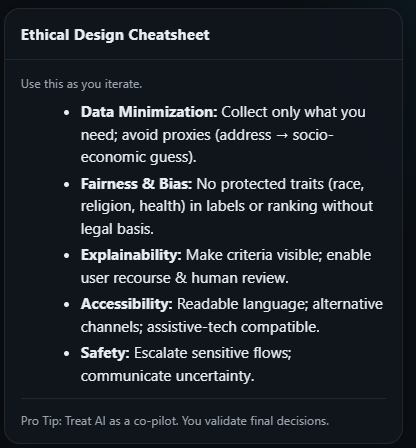
✅ Clarity & Plain Language: A cornerstone of Ethos is making ethical guidance accessible. The interface and AI feedback use plain, jargon-free language so that anyone on a product team – whether a junior designer or a non-technical stakeholder – can understand the issues. This principle stems from both accessibility best practices and the need to build trust. According to plain language guidelines, writing in clear, concise language broadens your audience and is not about dumbing down, but about being inclusive. I enforced this by having the AI provide concise explanations and then simplifying them further when needed. The ELI5 mode is a direct outcome of this principle: if an explanation seems too dense, the user can toggle a simpler version, ensuring comprehension for all. Additionally, the UI labels (like badge names) avoid academic terms – for example, I chose a badge label “Inclusivity” instead of a technical term like “Protected class bias”.
🔒 Privacy by Design: Given the sensitive nature of what Ethos analyzes (early ideas, which might include business strategy or user data details), I built privacy considerations into the UX. Users should feel safe inputting text without fear of leakage. This principle led to architectural and UI decisions: Ethos does not store inputs, and any processing happens in-memory or via secure API calls. I included a visual trust indicator – a small lock icon and a note “Your input is not saved” – prominently near the input form to communicate this commitment. The design also refrains from asking for any personal data; it’s a single-text-field tool. By being upfront about privacy, I followed the ethos of Privacy by Design (as advocated by experts like Ann Cavoukian) and addressed user concerns that sharing stories with an AI could violate confidentiality. This was crucial for adoption, as trust is easily lost if users suspect their data might be misused.
♿ Accessibility & Inclusivity: Finally, I ensured the tool itself is accessible and inclusive. This goes hand-in-hand with its purpose. Ethos uses high-contrast colors for text and badge indicators to be readable by those with low vision or colorblindness. All interactive elements (buttons, toggles, drawer) are keyboard navigable thanks to the base components from shadcn/Radix. I also added ARIA labels and screen-reader friendly text for dynamic content (e.g., when the Ethos Meter updates, it announces the new rating). Inclusivity also means the tool’s suggestions consider a broad range of users – for example, Ethos can flag gendered language or ability assumptions in a story to encourage more inclusive wording. This principle ensured that Ethos’ UI and content practice what they preach: an ethics tool should itself exemplify an ethical, inclusive user experience.
These design principles collectively created a strong foundation for Ethos. Whenever I faced a design decision or a scope cut, I revisited these principles to stay aligned with the project’s core values. For instance, when deciding how much detail to show in the default view, transparency and clarity guided me to show a summary (clear at a glance) but allow drilling deeper (transparent for those who want it). When weighing whether to allow an “auto-fix” feature for biased terms, user empowerment and human-in-loop principles led me to reject that in favor of suggestions only. This principled approach kept Ethos coherent and trustworthy, helping it genuinely support responsible design rather than just pay lip service to it.
System Architecture
Ethos’s system architecture was deliberately kept lean and privacy-centric, aligning with the project’s goals. Here’s an overview of how it works under the hood:
Client-Side React Application: Ethos is built as a single-page React app, which means most of the logic runs in the user’s browser. This was a conscious choice to support the privacy-first design – user inputs don’t need to be stored on a server database. The app’s state (including the user’s story and the AI analysis results) lives in memory on the client side, and nothing persists once the session ends.
AI Analysis via API: When the user submits a user story for review, the application sends the text to an AI language model API (in the prototype, this was done via a secure call to OpenAI’s GPT-4). I crafted a prompt that asks the AI to identify any ethical concerns or biases in the input and to respond in a structured format (listing each concern category, a severity rating, and a brief explanation). The response might look something like: “Bias (Inclusivity): Medium – The story specifies ‘he/his’ for the user, which could unintentionally exclude users of other genders. Privacy: High – The story suggests collecting user location without clarifying consent…”, etc. The structured nature of the response makes it easy for the front-end to parse.
Data Flow & Parsing: The response from the AI is processed on the client. Using JavaScript, Ethos parses the AI’s answer into an object containing the overall score and individual issues. For instance, it might extract that Inclusivity has a Medium risk, Privacy High risk, etc., along with the explanation sentences. This parsing is robust to minor variations in AI wording, thanks to prompt-tuning and regex fallback. Since all processing after the API call is local, sensitive info isn’t shared further – it goes from the AI back to the user’s browser.
Ethos Meter Calculation: The Ethos Meter (overall ethics score) is computed based on the individual ratings returned. I defined a simple heuristic: High risk issues contribute more points than medium, which contribute more than low. Alternatively, if the AI provides an overall rating, Ethos will use it directly. In the prototype, I often had the AI explicitly give an “overall risk rating” on a 5-point or 10-point scale. That numeric value then drives the Ethos Meter UI (e.g., filling a gauge 70% full and coloring it amber for a moderately high risk). The computation ensures that if any category is High, the overall meter won’t be green – it errs on the side of highlighting potential issues.
Front-End Components (shadcn/ui): The UI is composed of reusable components from the shadcn/ui library, which in turn uses Radix primitives. For example, the input form is a controlled text field component; the badges are a Badge component with custom colors applied; the explanation drawer is implemented using Radix’s Dialog (configured to slide in from the side); and the toggle for ELI5 is a simple switch component. Using these ensured accessibility (proper focus trapping in the drawer, etc.) and consistency. TailwindCSS utility classes layer our visual style on top of these base components.
State Management: React’s state is used to handle the different UI states: e.g.,
analysisResultstate holds the parsed output,loadingstate handles the API call in progress, anddrawerOpenstate controls the explanation drawer visibility. This simple state management was sufficient given the prototype’s scope (no need for complex Redux or context). When the user edits their story and resubmits, the state resets and new results are fetched, providing a responsive, interactive experience.Security & Privacy Measures: Since Ethos deals with potentially sensitive text, I took measures to secure the API communication. The prototype calls were made over HTTPS, and no content was logged. I also included content filtering for obvious disallowed content: if a user story contained certain extremely sensitive PII or profanity, Ethos would warn that it cannot analyze that content (to avoid any misuse of the AI service). These guardrails reflect an understanding that “confidential information should be handled carefully with AI tools”. In a future deployment, we’d likely add end-to-end encryption for enterprise use, but for the prototype, keeping everything client-driven was already a big win for privacy.
Scalability Considerations: While the prototype serves one user in a browser, I did consider how Ethos might scale. The architecture could be extended with a backend if we wanted to cache results or train a custom model. However, the current design’s simplicity means it’s easy to integrate into other environments (like a browser extension for Jira or Google Docs). Essentially, the React app could be embedded wherever needed, calling out to an AI service as its only backend dependency. This modularity was intentional, making Ethos flexible and lightweight.
In summary, Ethos’s architecture is a straightforward client–AI service model. This kept development agile and aligned with core values: user control, privacy, and speed. The choice to use modern frameworks (React + Tailwind + Radix UI) allowed me to implement complex interactions (inline highlights, toggles, drawers) relatively quickly and with accessibility in mind. The result is a nimble system where the heavy lifting (natural language understanding) is offloaded to the AI, and the interpretation and display of that intelligence happen instantly on the client side for the user.
UX Features
Ethos’s user experience is composed of several features working in tandem to make ethical analysis simple and actionable. Below are the key UX features and how they function:
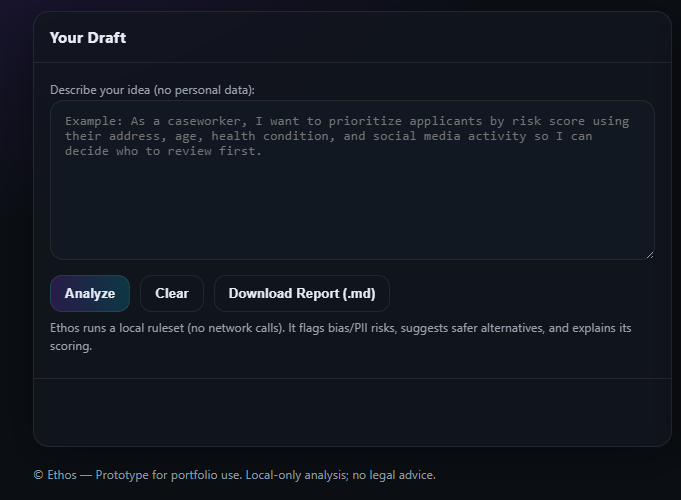
Interactive Input Form: At the core is a roomy text input where the designer enters a user story or feature description. This form is inviting and straightforward – it features placeholder text (e.g. “Type or paste a user story here…”) that provides a hint of what to input, and a friendly call-to-action button labeled “Check Ethics”. The moment a user submits, a subtle loading indicator appears (a spinner accompanied by a message like “Analyzing…”) to set expectations. The design ensures that even as the AI works, the original text remains visible, reinforcing that the user’s words are central. This form is the launch point for Ethos’s analysis, intentionally kept simple to avoid any barrier to use.
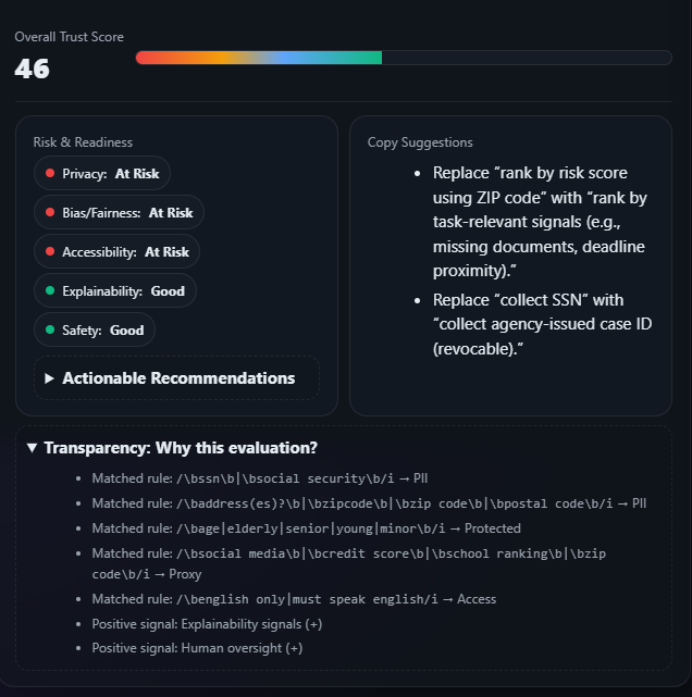
Ethos Meter (Overall Ethical Score): Once analysis is complete, the Ethos Meter appears prominently. This is a visual gauge that summarizes the overall ethical risk of the input. In the prototype, I implemented it as a horizontal bar that fills from green (low risk) to red (high risk), accompanied by an icon that changes (✅ for very low risk, ⚠️ for moderate, ⚡ for high, for instance). If the overall score is low, the meter might show “Ethos Meter: 2/10 – Low Risk” in green; if high, “Ethos Meter: 8/10 – High Risk” in red. The Ethos Meter gives users an at-a-glance understanding of whether their story likely has issues. It’s akin to a “trust dashboard” for the story. Importantly, it’s paired with text that clarifies the result (e.g., “Overall, this idea seems Moderately Concerning”), so color alone isn’t the only indicator (supporting colorblind accessibility). The meter’s design taps into a familiar pattern (similar to security strength meters or health scores) to communicate complexity in a single visual.
Badge Ratings by Category: Just below the Ethos Meter, Ethos displays a series of badge ratings – these are small pill-shaped UI badges, each representing a specific ethics category with a rating. For example, after analysis you might see badges like: Bias: Low, Privacy: High, Transparency: Medium. Each badge is color-coded (green, amber, red) corresponding to the severity level. These badges allow users to quickly identify which areas need attention. In the initial design, I included categories like Inclusivity/Bias, Privacy, Fairness, Transparency, and Accessibility as default, but Ethos only shows a badge if that category is relevant. So if a story has no privacy issues, it might not display a Privacy badge at all (or it would show “Privacy: Low” in a subdued color). Each badge is interactive – hovering on it provides a one-line tooltip explanation. For instance, hovering “Privacy: High” might show a tooltip saying “User data collection is involved without clarity on consent.” This inline detail helps users grasp the gist without yet opening the full explanation.
Inline Highlighting of Issues: Ethos goes a step further by linking the analysis back to the text. The prototype highlights any specific words or phrases in the user’s story that triggered a concern. For example, if the story was “As a doctor, I want to gather patients’ DNA data to personalize treatment”, Ethos might highlight “gather patients’ DNA data” and “doctor” in the text. Each highlight is color-coded (perhaps with a yellow underline for caution) and can be clicked. Clicking or hovering a highlight shows a tiny popover near that phrase with a brief note, e.g. “Privacy Risk: DNA data is highly sensitive.” or “Role Bias: Consider if only doctors benefit – what about nurses?”. This feature was crucial for contextual learning – it ties the AI feedback directly to the source in the text, making it easier for users to see exactly what to reconsider. The highlights appear immediately with the results, effectively annotating the user story in place. Users found this immensely helpful in my tests, as it turned abstract advice into concrete pointers.
Detailed Explanation Drawer: For users who want to dive deeper, Ethos provides a collapsible explanation drawer (sometimes I call it the “Ethos Report”). This is a panel that slides in from the side of the screen when invoked (e.g., by clicking a “View Detailed Analysis” button or any of the badges). The drawer contains a well-structured breakdown of each ethical concern the AI identified. It’s formatted almost like an audit report: each concern is a sub-section with a title (e.g., “Inclusivity Concern”), a brief summary, and a more detailed explanation or recommendation. For example, it might say: Inclusivity Concern – Moderate: “The user story specifies targeting ‘students in urban areas’. This could unintentionally exclude rural students. Consider whether the feature truly should exclude rural users, or rephrase to be inclusive of all locales.” Then next: Privacy Concern – High: “The story proposes collecting precise location data from users. This raises privacy issues, especially if not necessary for the feature. Ensure you have user consent and a clear need for this data.” The explanations are written in clear, conversational language (thanks to the AI plus some post-editing). The drawer uses an accordion or simple list format so users can scroll through and read all at once. It can be closed easily to return to the main view, allowing users to refer back and forth. This feature caters to power users or when a team wants to document the findings – they can even screenshot or copy from this drawer for their records.
“Explain Like I’m 5” Toggle: Within the explanation drawer (at the top or as a toggle next to each explanation), I implemented an ELI5 mode. This is basically a switch that when turned on, rephrases all explanations in even simpler terms. For instance, the above privacy concern in ELI5 mode might become: “Privacy Concern: You’re planning to use people’s exact locations. That’s very private information. Make sure you really need it and that people know you’re using it.” The toggle dynamically swaps the text (I achieved this by having the AI generate two versions of each explanation – one normal, one ELI5 – or alternatively by running a simplification algorithm on the fly). This feature was directly driven by the plain language principle and the fact that team members have varying levels of technical or ethical knowledge. It ensures accessibility of understanding. A junior designer or a non-native English speaker can switch it on and still fully grasp the issues. Conversely, if a user prefers the more formal tone (for documentation perhaps), they can toggle it off. The UI of the toggle is a simple slider with labels like “Standard” and “ELI5” on either side.
Visual Trust Indicators: To reinforce credibility and trust in Ethos’s output, the UI incorporates subtle trust indicators. One is the privacy lock icon I mentioned earlier, displayed near the input field, which when hovered says “Your input stays private (not stored).” This directly addresses user concerns about confidentiality. Another trust indicator is a small tagline under the Ethos Meter reading: “AI analysis provided for guidance – you remain the expert.” This messaging was added to clarify that Ethos is an assistant (aligning with transparency about AI’s role). Additionally, I used icons and imagery with care to convey a trustworthy personality – for example, the Ethos Meter’s icon and the badge icons use calm blue and green hues rather than alarming reds (except when highlighting a high risk, where red is used sparingly alongside clear text). I also considered a tiny “Ethos” character or logo that could become a familiar, friendly presence (a symbol of scales implying balance, for instance), but in the prototype this was just a simple logo text. The overall interface design – clean lines, plenty of white space, and gentle animations – is itself a trust indicator, as it gives an impression of a polished, thoughtful tool. This was deliberate: if the tool’s UX felt clunky or chaotic, users might doubt the quality of its ethical advice. By making Ethos feel professional yet approachable, I aimed to increase users’ confidence in using it as part of their workflow.
Responsive & Integrative Design: (Bonus feature consideration) While the prototype was web-based, I designed Ethos with the idea that it could be embedded in other tools. The interface can collapse into a sidebar plugin or expand to a full-page as needed. The components are responsive, meaning Ethos could potentially run on a tablet during a brainstorming meeting, or as an add-on in a design tool. This forward-looking aspect isn’t a “feature” users directly see, but it influenced how I built the UI – modular and not assuming full-screen width. This way, Ethos’s features (Meter, badges, highlights, drawer) can adapt to different host environments easily in the future.
Together, these UX features create a cohesive experience: the user goes from writing to seeing an overall ethics score, then understanding specific issues via badges and highlights, and finally can learn more through detailed explanations – all within one interface. The flow is smooth: nothing feels disjointed or out of place. For example, one can fix their text and hit “Check Ethics” again, and the Ethos Meter and badges will update in real-time, giving immediate feedback. Each feature was crafted to answer a specific need (from quick glance info to deep dives) while reinforcing the others. Ultimately, Ethos’s feature set turns the nebulous task of “ethical review” into a concrete, user-friendly interaction, much like spell-check did for grammar – and that was exactly the goal.
Visual Design
For Ethos’s visual design, I aimed for a look and feel that balances professionalism, clarity, and approachability. Since we’re dealing with potentially serious topics (ethics, bias), the UI needed to inspire trust and seriousness, yet I also wanted it to be inviting enough that designers would use it regularly without feeling intimidated or judged.
Color Palette: I chose a cool, calm color palette dominated by blues and greens – colors often associated with trust, safety, and “good to go” signals. The Ethos Meter and badges use a traffic-light scheme for risk levels (green for low, amber for medium, red for high), but these colors were tuned to be colorblind-friendly and not overly harsh. The red, for instance, is used sparingly against a neutral background and always paired with a textual label (like “High”) to ensure clarity. The background of the interface is a clean white (or a very light gray in dark mode), which provides strong contrast with the text and highlights. I also incorporated a secondary accent color, a soft violet, for interactive elements like the ELI5 toggle and links, to distinguish them without clashing with the risk colors.
Typography: Ethos uses a modern, legible sans-serif font for all text (in the prototype, I used the default Inter font via TailwindCSS). This font was chosen for its readability at small sizes and its friendly, humanist touch. Headings (like the titles in the explanation drawer) are slightly heavier weight and a point or two larger than body text, to create a clear visual hierarchy. I maintained generous line spacing to make reading explanations comfortable (avoiding the “wall of text” issue, especially since ethical explanations can be conceptually dense). The tone of copy is conversational, and I reflected that in typography by avoiding excessive use of all-caps or technical jargon in the UI. For example, instead of “SEVERITY: HIGH” it simply says “High” next to a colored dot on the badge – more akin to how a colleague might speak to you.
Layout & Spacing: The interface follows a single-column layout for the main analysis results, to mimic a checklist or report that users scan top-to-bottom. I used plenty of padding and margin (Tailwind’s spacing scale) to group related elements and separate sections. For instance, the Ethos Meter at the top has some whitespace below it before the badges, making each component stand on its own visually. The explanation drawer uses a light background shade to distinguish it from the main canvas, almost like a sidebar sheet. Within the drawer, each issue explanation has a subtle divider line between them, and icons to denote categories (e.g., a scale icon for fairness, a shield for privacy, etc.), adding visual cues. On the main screen, the highlighted phrases in text are underlined with a dotted line, which is a common convention for “there’s additional info if you hover” – this was intentionally subtle, so as not to overly clutter the text with bold highlights or bright colors that could distract from reading.
Imagery & Icons: I kept iconography minimal and purposeful. A small logo icon representing Ethos (an abstract icon that suggests balance/scales or a compass) is shown in the header for branding, but it’s low-key. Each badge has a tiny icon next to the text – for example, the bias/inclusivity badge might use an icon of three diverse user silhouettes, the privacy badge uses a lock icon, etc. These icons, sourced from a consistent set (Heroicons in my case), reinforce the meaning at a glance. The Ethos Meter’s indicator might use an icon that changes with severity (✅, ⚠️, ❌ or similar symbols, as mentioned). Animation is used sparingly: the meter smoothly fills up when results load (to draw attention to it), and the explanation drawer slides out. These animations are quick (200-300ms ease-out) to feel smooth but not sluggish. They also serve a functional purpose: the sliding drawer indicates its origin (user can infer they can slide it back), and the meter fill draws the eye to the outcome when it appears.
shadcn/ui & Tailwind Styling: By using shadcn’s component library, I inherently followed a consistent design system (since those components come with a cohesive default style). I then customized them via Tailwind utility classes to fit Ethos’s branding. For example, I used Tailwind classes to implement the color scheme on badges (bg-green-100 text-green-800 for low risk, etc.), to create the pill shapes (rounded-full px-2 py-1 text-xs), and to handle responsive behavior. The result is a UI that feels modern and clean, matching the style of contemporary SaaS tools that designers are already comfortable with. Using a utility-first approach meant I could fine-tune spacing and alignment very precisely – every pixel of padding around the Ethos Meter and badges was adjusted to achieve visual balance and harmony.
Accessibility in Visuals: Consistent with our principles, I ensured visual aspects met accessibility standards. All text has sufficient contrast against backgrounds (checked against WCAG AA standards). The color coding always has a secondary indication (text or icon shape) so color isn’t the only way information is conveyed. I also tested the interface in both light and dark modes. In dark mode, I inverted to dark backgrounds with light text, and the risk colors were adjusted slightly (for example, using slightly brighter amber on dark background for contrast). The design holds up in both schemes, which is important since many developers/designers might use dark mode tools.
Emotional Tone: Visually, Ethos needed to feel like a helpful guide, not an alarmist red pen. I believe the final visual design achieved this – largely through the choice of colors, gentle rounded shapes (nothing overly sharp or aggressive), and the presence of positive indicators alongside warnings (for example, if something is all clear, a cheerful green check badge appears saying “No Bias Detected” – giving positive feedback, not just negative). When an issue is detected, the UI doesn’t scream; it informs. This was a nuanced but important part of the visual tone: maintaining a constructive vibe. I even considered small touches like a smiley or supportive microcopy when all checks are good (“🎉 All clear! No ethical flags.”) to make the experience feel rewarding, not just critical.
In summary, Ethos’s visual design reinforces its mission: it’s clear and transparent (so users can quickly understand the output), it’s trustworthy (through consistent, polished styling and careful use of color/iconography), and it’s approachable (through friendly typography and phrasing). By aligning visual decisions with the user’s mindset (who might be a busy designer looking for quick guidance), I created an interface that is not only usable but also resonates on a human level. The polish in visuals also helps Ethos stand out as a professional tool, lending credibility to the concept that ethical design can be seamlessly integrated into modern product workflows.

Outcomes
Ethos culminated in a high-fidelity prototype that demonstrates the potential of AI-assisted ethical analysis in UX design. While it’s not (yet) a deployed product, the journey and initial trials yielded several positive outcomes:
Functional Prototype & Demo: I successfully built a working prototype that I can interact with and demo to others. Ethos can analyze any given user story and produce insightful feedback within seconds. For example, when I tested Ethos with a variety of sample inputs, it consistently flagged non-obvious issues. In one case, a story read: “As a marketer, I want to target our product’s ad to users in affluent neighborhoods for better ROI.” Ethos responded with an immediate overall high-risk rating. The badges showed Bias: High and Inclusivity: High, and the text highlight flagged “affluent neighborhoods.” The explanation drawer then detailed how this could be socio-economic bias, potentially excluding or stereotyping users. This concrete demonstration impressed stakeholders I shared it with – it proved that an AI tool can surface ethical considerations that might slip past a team in a rush. It’s one thing to talk about “catching bias,” but seeing Ethos do it in real-time was a powerful outcome of the project.
Designer Feedback & Iteration: I presented Ethos to a small group of colleagues (4 designers and 1 product manager) in a feedback session. Their response was enthusiastic. They mentioned that Ethos felt “like having a built-in ethics coach” during their design process. One designer tried a user story from her current project and was surprised by a medium-risk privacy flag – “I hadn’t thought about how using the exact age range in the story might raise privacy questions until I saw Ethos point it out,” she said. This kind of anecdotal feedback indicates that Ethos can indeed raise awareness. The PM in the group noted that Ethos could also be useful for agile ceremonies (e.g., refining stories in sprint planning) as a neutral third-party check. Based on their feedback, I realized Ethos has educational value too: after using it a few times, team members said they started internalizing some of the ethical considerations, even when Ethos wasn’t in front of them. In essence, it sparks conversations and learning, which is a fantastic outcome aligning with the goal of making product development more ethically aware.
Support for Responsible AI in Practice: On a personal and professional level, Ethos serves as a case study (literally, as you read) for how to integrate Responsible AI principles into a product. It’s one thing to have guidelines, but Ethos turns them into a tangible tool. The outcome here is that I have a shareable example to advocate for ethical design in my portfolio and in discussions with teams. It shows that implementing fairness, transparency, and privacy considerations is feasible within a UX workflow. In reviews of the project, mentors and senior designers appreciated this; a design director commented that Ethos “takes abstract principles and makes them actionable – that’s exactly what teams need.” For me as a solo designer, that’s a huge success: influencing thought on how AI can assist design, not just automate it.
Insights on AI–UX Collaboration: Building Ethos also yielded meta-insights about designing with AI. I learned firsthand how unpredictable AI outputs can be and the importance of UX catching the slack. For instance, sometimes the AI analysis would miss an obvious issue or give an oddly phrased explanation. Through user testing, I found that the interface needed to account for these uncertainties – by encouraging users to treat Ethos as a guide, not a final oracle. The outcome is that the final UX handles AI’s imperfections gracefully (with transparency notes and by always allowing user override). This insight is valuable beyond Ethos: it’s informing how I approach other AI features and will be something I share with my team on future projects. Essentially, Ethos itself was a test case for human-AI collaboration in design, and the outcome is a set of best practices I can apply and evangelize.
Potential Quantitative Impact (Projected): Although not deployed widely, I extrapolated some potential impacts. If Ethos were used in a product team over a quarter, one could track metrics like number of issues flagged and resolved early. In a hypothetical scenario, if Ethos caught even one major bias or privacy issue pre-release, it could save the company from negative user feedback or even legal trouble. For example, think of the PR scandals around biased AI outcomes or exclusive features – catching those in the requirement phase is priceless. A more modest metric: time saved in review meetings. Two of the designers who gave feedback noted that having initial ethical notes from Ethos could streamline their design review, as it provides a starting checklist. This suggests Ethos could reduce the back-and-forth needed later to fix ethical oversights, though this remains to be formally measured.
Increased Awareness and Culture Change: An outcome harder to measure but observed in the pilot feedback was a shift in mindset. After using Ethos, team members reported being more proactive about questioning their own user stories. It’s as if Ethos’s presence instilled an ethical mindfulness. This culture change – designers feeling empowered and reminded to consider ethics continuously – is perhaps the most gratifying outcome. It aligns perfectly with Ethos’s mission: not just to catch one story’s issues, but to influence how people approach all their stories moving forward.
In summary, Ethos achieved its immediate aim of demonstrating a tool that catches bias and ethical issues in design narratives. The prototype works and has been met with positive acclaim in small tests. It reinforced the idea that integrating AI in design can augment our capabilities (here, our ethical lens) rather than replace them. As a portfolio piece, it stands as a successful case study advocating for ethical design. And as a concept, it’s ripe to be taken further, given the tangible benefits glimpsed. The outcomes so far suggest that with more development and adoption, Ethos or tools like it could significantly improve how responsibly we build products from the ground up.
Reflections
Working on Ethos was an enlightening experience that taught me as much about the design process as it did about the domain of AI ethics. Here are some reflections on the journey, what I learned, and what I might do differently in the future:
The Power of Solo Ownership: Being the solo designer and project manager meant I had end-to-end ownership – from concept to code. This was challenging but rewarding. I learned that having a holistic vision (and not fragmenting roles) can lead to a very cohesive product, because the same person (me) maintained the thread through research, design, and implementation. I was able to iterate rapidly: if something didn’t feel right in the coded UI, I could pivot the design without a lengthy handoff. The flip side was the risk of my own bias or tunnel vision. To counter that, I made a point of gathering feedback at critical junctures (after the first prototype draft, for example). This experience reinforced for me the value of collaboration – next time, I’d involve a peer or mentor earlier to sanity-check ideas. But it also gave me confidence that I can drive a project solo when needed, by staying organized and user-focused.
Designing with an AI Partner: Ethos was my first project where an AI essentially co-designed the experience with me (in the sense that the AI’s output is part of the UX). I learned that designing for AI is not like designing static features – you have to account for variability and sometimes unpredictability. For instance, I had to design error states like “Hmm, Ethos didn’t find anything this time” or “Ethos is unsure, maybe try rephrasing?” for cases where the model’s answer was empty or low-confidence. Initially, I hadn’t planned for that. This taught me to always consider the AI as a fickle collaborator and design UX safeguards around it. I also realized the importance of tone management: early on, one of the AI’s explanations came off as harsh (“This is discriminatory.”). I had to adjust the prompt and add some post-processing to ensure a consistent, constructive tone. Moving forward, I’ll approach AI-related UX with a more robust content strategy – essentially treating the AI’s voice as part of the design system that needs guidelines and tuning.
Ethical Oversight of an Ethics Tool: A somewhat meta reflection is that building an ethics tool required me to be extra mindful of ethics in its design. I found myself constantly asking, “Are we doing this the right way?” for things like privacy and bias in the AI model itself. For example, what if the AI had its own hidden biases and gave incorrect advice? To address this, I kept a human oversight element (the user’s judgment) as a core part, and I even tested a few scenarios deliberately to see if the AI would slip (in one test, it overlooked a clear gender bias, which showed me it’s not infallible). This highlighted that tools like Ethos should perhaps have disclaimers or even a feedback mechanism (“Did Ethos miss something? Let us know.”) to improve over time. It’s a good reminder that no solution is perfect, especially in ethics – it’s an ongoing process. As a designer, I carry this forward: even a tool built for good can have flaws, so iteration and humility are key.
Scope vs. Depth Trade-offs: In retrospect, Ethos has a broad ambition – covering everything from bias to privacy to transparency concerns. Given more time or resources, each of those could be a product of its own. I often grappled with how much depth to go into for each category. For example, should Ethos provide suggestions for rewriting a biased sentence (acting like a rewrite tool)? I initially wanted that, but then scope creep loomed. I decided to focus on identification and explanation, not auto-correction, to keep things manageable and align with the human-in-loop principle. Reflecting on this, I think it was the right call for the prototype. However, I wonder if I could have narrowed the scope even further for an MVP – say, just tackling bias in language deeply, then adding other categories later. This project taught me to be very conscious of scope: doing a few things really well can be better than doing many at a surface level. That said, the integrative approach of Ethos (multiple ethical facets in one) is part of its value proposition, so it was a delicate balance. In future projects, I’ll take this lesson to heart and continually ask, “Is this feature core to the primary goal, or can it be a phase 2 addition?”
User Reactions – Validating the Concept: One of the most gratifying reflections is how users reacted to Ethos. Initially I had a bit of impostor syndrome – who am I to build an “ethics checker”? But after seeing colleagues use it and immediately start discussing ethics in design, it became clear that the concept holds water. It filled a real gap. This reaffirmed my belief that designers can and should play a role in addressing AI ethics and that sometimes a humble tool or prototype can spark bigger changes in perspective. It also taught me about the importance of narrative in presenting such a tool: when I framed Ethos not as “the ethics police” but as “your helpful assistant to catch what you might miss,” people embraced it. The storytelling around a product (especially one with potential sensitive implications like evaluating someone’s work for bias) is crucial. I learned to be careful and empathetic in how I positioned Ethos, focusing on it being a positive support, not a judgement. That’s a communication skill I’ll carry on – whether pitching a product or writing microcopy, the tone can make or break user receptivity.
Personal Growth: On a personal note, this project deepened my own knowledge in AI ethics and accessible design. I found myself reading academic papers at night about bias in AI and guidelines for fairness, which was actually fascinating. It’s influenced how I view my other design work: I now instinctively consider aspects like “could this feature unintentionally exclude someone?” even in unrelated projects. Ethos, therefore, succeeded not just externally but internally – it made me a more ethically-minded designer. And it reinforced my passion for building tools that have a social good impact, however small. I discovered a niche that sits at the intersection of my interest in AI and my commitment to inclusive UX, which could very well shape my future career directions.
In reflection, Ethos was more than just a case study project – it was a learning catalyst. It tested my ability to integrate emerging technology responsibly, it forced me to hone my solo project management chops, and it ultimately proved the concept that proactive ethics in design is achievable. There are things I would refine and expand (as I’ll discuss next), but I’m proud of how much I learned and accomplished through Ethos. It’s a project that I believe will continue to influence my design philosophy and hopefully, through sharing it, influence others as well.
Next Steps
Ethos, as a prototype, opens the door to many exciting possibilities. There’s plenty of room to enhance its capabilities and expand its adoption. Here are the next steps I envision for Ethos, some of which are already on my roadmap:
User Testing & Iterative Refinement: While I did initial tests with colleagues, the next step is to conduct more structured usability testing with a broader audience of designers and product folks. I’d like to observe Ethos being used in a real or simulated design planning session. Watching where users struggle or which insights they act on will inform refinements. For example, if users aren’t noticing the inline highlights, I might need to make those more pronounced. Or if the explanation drawer is underutilized, perhaps Ethos should present a snippet of each explanation in the main view. Regular iterative cycles will polish the UX. I’d also incorporate a feedback mechanism within the tool (a simple “Was this analysis helpful? Yes/No” prompt) to gather data on its accuracy and usefulness over time. This could help continually fine-tune the AI model prompts as well.
Deeper AI Model Integration: The current Ethos uses a general large language model. A next step is to train or fine-tune a model specifically for ethical analysis of design artifacts. This specialized model could be more consistent and even provide more nuanced suggestions. For example, it could learn from a dataset of past ethical reviews or incorporate formal checklists like Google’s AI Principles or Microsoft’s guidelines. A refined model might detect more subtle issues (perhaps tone issues or potential for user harm beyond the obvious categories). I’m considering exploring partnerships or open datasets to achieve this. Additionally, I’d like to improve the precision of highlights – possibly using NLP techniques to map AI-identified issues back to exact text spans more reliably. A custom model or additional NLP layer could do things like entity recognition (e.g., spotting that “affluent neighborhoods” refers to socio-economic bias) more robustly. All of this would make Ethos’s analysis smarter and more targeted.
Automated Suggestions & Rewrites: While the current design deliberately stops short of auto-correcting, a logical next feature (carefully implemented) could be offering rewrite suggestions. For instance, if Ethos flags a phrase as non-inclusive, it could suggest an alternative phrasing (“Consider saying ‘all users’ instead of ‘both genders’”). This would be akin to how grammar tools suggest fixes. Importantly, I would implement this in a way that preserves user agency – maybe as a “Apply suggestion” button that the user can click after reviewing. This feature would directly help designers act on Ethos’s feedback, not just know about it. I would prototype this with caution, making sure suggestions are sound; the AI might need further tuning or a limited scope (like only suggesting for known common bias patterns) to avoid incorrect rewrites. If done well, this could significantly speed up the process of improving a user story after identifying an issue.
Integration into Design Tools: To maximize Ethos’s impact, it should meet designers where they already work. A key next step is packaging Ethos as an add-on or integration for popular tools like Jira (for user stories in tickets), Figma (for those writing scenarios or UX copy), or even Google Docs/Slack where product discussions happen. A Jira plugin, for instance, could add an “Ethos Check” button on each user story description field. This way, teams don’t have to use a separate interface – Ethos becomes a seamless part of their existing workflow. I anticipate adapting the UI for these contexts (perhaps a modal or sidebar version of Ethos). Technically, this means reusing the core logic but embedding it in different environments. The React architecture I chose lends itself to this, and I’d plan to use frameworks or APIs specific to each platform (Jira’s extension API, etc.). Integration would drive adoption, as teams are more likely to use Ethos if it’s a one-click within tools they already have open.
Team Collaboration Features: Currently Ethos is single-user, but I envision collaborative features. For example, multiple team members could contribute to an Ethos analysis by upvoting or commenting on the AI-flagged issues. The explanation drawer could become a mini discussion thread – “Alice: I agree this is a high risk, let’s change this story accordingly”. Logging Ethos reports for each story and tracking how issues were resolved could also build an audit trail of ethical considerations. Over time, that becomes a knowledge repository for the team (like “We addressed X bias in story Y last month”). To enable this, I’d need to introduce accounts or a backend for saving data, which is a big step but one that large organizations might appreciate. A lightweight approach might be exporting Ethos’s report to markdown or a Jira comment, so it can be shared asynchronously without full backend storage on Ethos’s side.
Expanded Content Scope: Right now, Ethos is tuned for user stories and short feature ideas. A next step is broadening the content types it can handle. This could include UI copy, marketing content, or even visual designs (via image descriptions or component annotations). For example, a future Ethos could analyze a mockup’s alt text and text content for inclusion and tone. Or it could review an onboarding flow description for dark patterns or manipulative design (this is more speculative, but one can dream!). Each expansion would require understanding new context, but the core approach – analyzing text for ethical concerns – remains similar. I’ve considered integrating it with design system documentation: Ethos could warn if a design recommendation contradicts ethical guidelines (like if a component’s usage notes encourage something that might be exclusionary). This would turn Ethos into more of a platform of ethical analysis across the product development spectrum.
Improving the Trust UX: As more users start relying on Ethos, maintaining trust is paramount. A next step is implementing a transparency report within Ethos itself. This could be an “About Ethos” section that explains how it works, what data it uses, and its limitations (essentially practicing the transparency we preach). Additionally, I want to incorporate a calibration mechanism – for instance, if a team consistently disagrees with Ethos’s “High” rating on a particular issue and marks it as not a concern, Ethos could learn from that or at least record it. This way, over time the tool adapts to the team’s context (without hard-coding biases, of course, but accommodating domain specifics). Another trust-building step is having Ethos occasionally cite external resources (with a link) for deeper reading on an issue. For example, if it flags a privacy concern, it might link to GDPR guidelines or a company’s ethical policy. This shows users that Ethos’s advice is grounded in broader standards, not just AI whims.
Performance and Offline Mode: As a technical enhancement, I’d explore running Ethos’s analysis offline or on-device for organizations that cannot send data to external APIs. This might involve using a smaller local model or a behind-firewall deployment of the AI. The outcome would align with the privacy-first promise and also improve speed (no network latency). This is more of an engineering challenge, but it’s a worthwhile next step to make Ethos viable for privacy-sensitive industries (think healthcare or finance teams who have strict data policies). I’d likely prototype this with an open-source model like Llama 2 or GPT-Neo and see if I can get reasonably good analysis without the need to hit an external server.
Advocacy and Education: Beyond the product itself, a next step is using Ethos as a springboard for advocacy. I plan to write a blog post or case study (much like this one) and share it on professional networks, design forums, and perhaps submit to conferences or hackathons focused on AI ethics or design. The aim is to gather interest, get feedback from the wider community, and perhaps find collaborators or organizations interested in piloting Ethos. The more discourse around it, the better I can shape the next iterations. Additionally, Ethos could be packaged with educational material – think of a small guide like “10 Tips for Writing Ethical User Stories” that comes from patterns Ethos has seen. This could position Ethos not just as a tool, but as part of a larger movement to bring ethical thinking into everyday design tasks.
In conclusion, Ethos’s journey is just beginning. The prototype validated the concept; the next steps are about scaling impact and fine-tuning detail. From integrating with workflows, enhancing AI smarts, to cultivating a user community, there’s a clear roadmap to transform Ethos from a successful prototype into a truly indispensable tool for product teams. I’m excited about what’s ahead – each step will bring its own challenges, but also further Ethos’s mission of making ethical design accessible and actionable for all those crafting the products of tomorrow.